With its fresh, vibrant redesign, Abastible successfully revitalizes its brand identity while staying true to its roots.
Abastible is a prominent Chilean energy company specializing in the distribution and commercialization of liquefied petroleum gas (LPG). Founded in 1956, the company has grown to become one of the leading energy providers in Chile, offering solutions for both residential and industrial use. Abastible is part of the Empresas Copec group, one of the largest conglomerates in Latin America.
Headquartered in Santiago, Abastible has consistently positioned itself at the forefront of sustainable energy innovation, also expanding its services to other Latin American markets, including Colombia, Peru, and Ecuador.
Logo Evolution and Redesign
The logo showcased is part of Abastible's recent brand refresh, which marks a strategic shift toward modernization and renewed energy focus. The new visual identity was unveiled to better reflect the company’s commitment to sustainability, customer connection, and technological innovation.
Previously, Abastible used a more traditional wordmark combined with a flame motif. The updated logo simplifies the design, moving towards a more digital-friendly and contemporary appearance while maintaining the brand's signature orange and blue color palette.
Logo Design Analysis
Shape and Structure
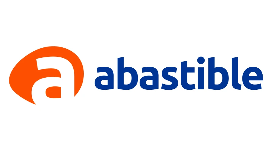
The logo features a lowercase “a” housed within a bold, orange oval-like shape to the left of the word “abastible.” This stylized "a" acts as a strong visual anchor and instantly identifies the brand. The organic, rounded shape evokes warmth and energy—both key associations with gas and flame.
The wordmark "abastible" is rendered in a custom, rounded sans-serif font. The choice of lowercase letters adds a sense of approachability, modernity, and accessibility. The typography is clean and balanced, with slight curvature that harmonizes with the logo icon.
Colors
The primary colors used in the logo are a vibrant orange and deep blue. These hues are both symbolic and functional:
-
Orange: Represents energy, warmth, and innovation. It captures the essence of flame and heat, aligning directly with the company’s core business in LPG.
-
Blue: Suggests trust, reliability, and professionalism—key traits for a company in the energy and utilities sector.
The contrast between orange and blue ensures strong visual impact and clear brand recognition across both print and digital formats.
Logo Type
This logo is a combination mark, consisting of both an icon (the orange shape with the “a”) and a wordmark (“abastible”). Combination logos are highly versatile and adaptable across a variety of marketing materials.
Usability and Versatility
The design is highly scalable, responsive, and effective in both horizontal and vertical applications. Its modern simplicity ensures usability in mobile apps, websites, vehicle wraps, and LPG cylinder branding.
Brand Message and Identity
The redesigned logo visually communicates Abastible’s mission to offer efficient and sustainable energy solutions. The friendly typeface, combined with the energetic color scheme, underlines the company’s customer-centric approach and forward-looking vision.
This change is not just aesthetic—it mirrors Abastible’s strategic evolution toward a cleaner, more digital future in the energy sector. The new branding reaffirms the company’s relevance in a rapidly changing global energy landscape.
File Formats and Availability
The Abastible logo is available for free download in high-quality vector formats such as SVG, PDF, AI, and transparent PNG from logowik.com. These formats are ideal for both professional printing and digital applications.
With its fresh, vibrant redesign, Abastible successfully revitalizes its brand identity while staying true to its roots. The logo not only reflects the company’s core values but also positions it as a modern, trustworthy energy partner for the future.


