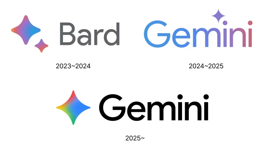
Google has introduced a new logo for its AI platform Gemini, replacing the old purple-blue gradient with a colorful design that uses Google’s signature colors—blue, red, yellow, and green. The star-shaped icon remains but has been softened for better visibility and a more friendly appearance. This rebranding aligns Gemini more closely with other core Google products, signaling its importance in the company’s ecosystem. Alongside the visual update, Google also revamped the user interface and added features like model selection improvements and personalized AI recommendations.
Google has unveiled a new logo for its AI platform Gemini, signaling not just a visual update, but also a strategic shift in how the company wants users to perceive and interact with its AI services. The transformation of the Gemini logo reflects Google’s broader goal of integrating Gemini more closely into its core product ecosystem, alongside established names like Search, Chrome, and Google Play.
Evolution of the Gemini Logo – From Soft Gradients to Google's Signature Colors
The original Gemini logo featured a clean, modern sans-serif wordmark with a cool-toned gradient ranging from blue to purple. This earlier design emphasized a calm, intelligent, and futuristic character, aligning with the AI assistant’s focus on thoughtful interaction and powerful capabilities.
In contrast, the new Gemini logo introduces a bolder, more inclusive visual language. The familiar star-shaped icon remains at the core of the identity, but it has undergone a significant refinement. Its sharp points have been softened, creating smoother, more inviting curves. This change enhances legibility on small screens and mobile devices while maintaining the logo’s instantly recognizable form.
Most notably, the new color scheme abandons the previous purple-blue tones in favor of Google’s iconic primary color palette—blue, red, yellow, and green—blended into a vibrant gradient. This move firmly ties Gemini to Google’s visual ecosystem, echoing other flagship products.
Meaning Behind the Shapes and Colors
From a design perspective, the updated Gemini icon reflects a modern and friendly approach. The symmetrical four-point star, often associated with illumination and guidance, subtly communicates the idea of AI as a tool that enlightens and assists users in their tasks. The shift to a full-color gradient evokes dynamism, diversity, and the full range of capabilities that Gemini offers.
The typography remains clean and geometric, with a custom sans-serif typeface that conveys clarity and professionalism. The lowercase “i” characters with their circular dots add a touch of friendliness to the otherwise bold structure.
Strategic Alignment with the Google Brand
Google’s decision to rebrand Gemini visually is closely tied to its long-term strategy. Rather than positioning Gemini as a standalone experiment, the new branding embeds it deeply within the Google ecosystem. This parallels how other successful products like Gmail, Chrome, and Google Maps have become integral to users' digital lives.
The new Gemini identity already appears across key surfaces such as the Gemini product page, Android home widgets, and social platforms like Instagram. It has not yet fully rolled out to iOS and the web app, but this transition is expected to happen gradually as part of a unified branding rollout.
Beyond Visuals – Enhancing User Experience
Alongside the logo change, Google has also improved the Gemini user interface to provide a better experience across Android and web. The model selection interface has been redesigned, now placing model names beneath feature descriptions for enhanced readability. The AI models are now more clearly differentiated by use case:
-
Gemini 2.5 Flash for fast, everyday help
-
Gemini 2.5 Pro for advanced reasoning, coding, and complex tasks
A preview of personalized recommendations—based on data from Gmail, search history, and more—has also been introduced, demonstrating Google's vision for a deeply integrated AI experience.
Download and Usage of the Gemini Logo
Designers and enthusiasts looking to explore or use the new Gemini logo can find it in vector formats such as SVG, PDF, AI, and also as a transparent PNG. These files are available for free download from logowik.com, allowing for professional use across both digital and print media.
A Logo That Reflects the Future of Google AI
The new Gemini logo isn’t just a fresh coat of paint—it’s a reflection of Google's deeper ambitions for artificial intelligence. The colorful, modern star icon and clean typography place Gemini within a family of trusted Google services, while also symbolizing intelligence, speed, and adaptability.
By aligning its design language with Google's core identity, Gemini steps forward not just as an AI tool, but as a central pillar in the company’s evolving digital ecosystem. As AI continues to become a more integrated part of everyday life, Gemini’s updated visual presence reinforces trust, accessibility, and innovation at every touchpoint.


