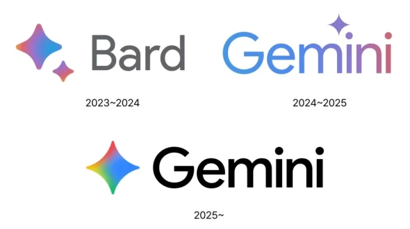
Gemini is a family of generative AI models developed by Google DeepMind, designed to compete with leading models like OpenAI's GPT series. The Gemini brand represents Google's most advanced artificial intelligence capabilities, integrating natural language processing, image understanding, and coding assistance under a single suite. Gemini was officially introduced in late 2023, succeeding the Bard chatbot, and has since become the central branding for Google's AI tools.
In June 2025, Google unveiled a refreshed identity for Gemini, marking a strategic design evolution aligned with the growing importance of AI in the company's product ecosystem. This rebranding emphasized simplicity, intelligence, and a unified user experience.
The original Gemini branding shared much of its visual DNA with Google's standard branding language: clean typography and minimal use of color. However, the June 2025 logo introduced a distinct icon that sets Gemini apart from the rest of Google’s product family. This update reflects Gemini's maturation as a standalone product line and its growing role in enterprise, education, and productivity environments.
The new symbol helps distinguish Gemini as more than just another Google tool—it’s a flagship AI platform. The rebrand reflects not only a visual shift but a positioning shift: from experimental AI to a trusted, intelligent assistant at the core of users' workflows.
The new Gemini logo embodies both clarity and futuristic sophistication. Here's a detailed breakdown of its visual identity:
The wordmark uses a custom sans-serif typeface that balances professionalism and approachability. The clean, geometric characters are slightly rounded, which softens the look and adds a human touch to the technological product. The bold weight of the typeface communicates confidence and innovation.
The new Gemini symbol is a four-pointed star or diamond shape, rendered with a radiant gradient that transitions through Google's signature colors: red, yellow, green, and blue. This prismatic effect conveys multidimensional intelligence, aligning with the AI model’s capability to understand language, images, and code.
The star shape subtly suggests illumination and discovery—an apt metaphor for an AI assistant meant to generate ideas, solve problems, and provide clarity. Its symmetry and fluidity give the impression of motion and adaptability, two key traits of modern AI systems.
This is a combination mark—it uses both a symbol and a wordmark. This offers flexibility: the icon alone can serve as an app symbol or favicon, while the full wordmark reinforces the brand name in more formal settings.
The curved diamond form of the icon leads the eye smoothly into the "G" of "Gemini", creating a natural visual flow. The balanced composition of the logo ensures strong brand recall and adaptability across screen sizes and platforms.
The Gemini logo can be downloaded for free in vector and transparent formats such as SVG, AI, PDF, and PNG from logowik.com. These formats ensure scalability and high-quality reproduction for both digital and print use.