
- Brands Logos
- Logo Templates
- Icons
- Vectors
- Font In Logos
- Blog
Cadillac, an iconic American luxury automobile brand founded in 1902 by William Murphy, Lemuel Bowen, Henry M. Leland, and Robert Faulconer, has historically been a symbol of American automotive excellence. As a division of General Motors (GM), Cadillac has consistently positioned itself as a leader in innovation, luxury, and performance. In a groundbreaking move, Cadillac announced its entry into Formula 1 in collaboration with Andretti Global, marking a historic moment for American motorsport. This partnership reflects Cadillac’s commitment to global performance and electrification.
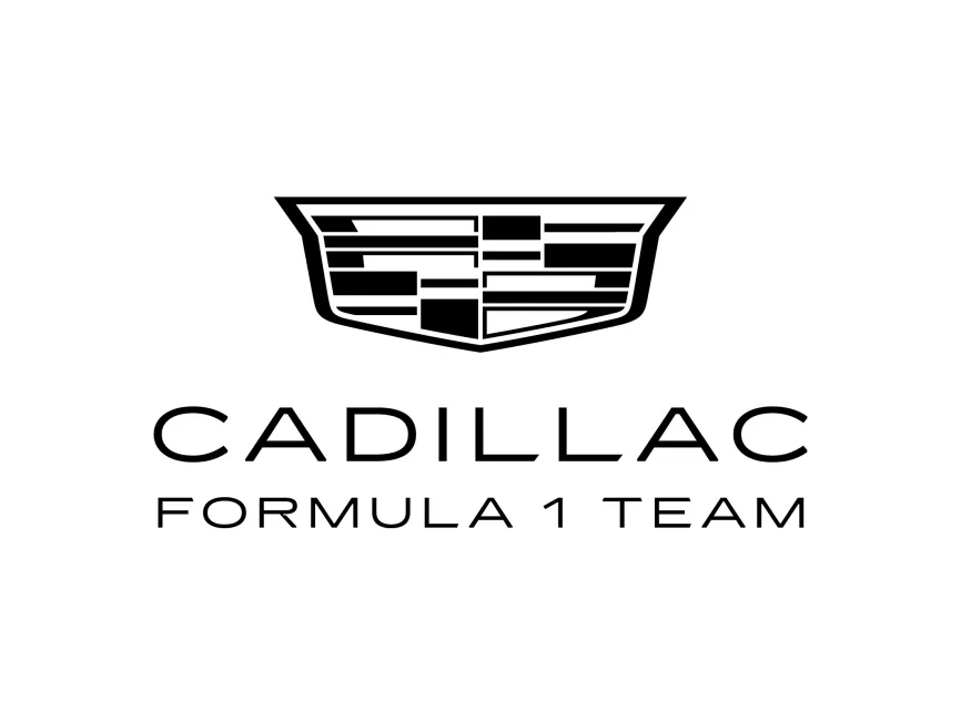
Cadillac’s logo has evolved significantly over the decades. Originating as a crest inspired by the family coat of arms of Antoine de la Mothe Cadillac, the logo has gone through multiple redesigns—from intricate, ornamental versions to a more minimalist, streamlined emblem. The current iteration, as seen in the Cadillac Formula 1 Team logo, takes a bold step toward modernization while retaining the essence of Cadillac's heritage.
The Formula 1 logo variation reflects a more performance-oriented identity. Stripped of its traditional colors, the crest appears in a clean black-and-white format, emphasizing simplicity, speed, and focus. The choice to go monochromatic aligns with Formula 1's precision and high-tech image, while the streamlined typography emphasizes elegance and forward motion.
The Cadillac Formula 1 Team logo features two main elements: the abstract crest and the wordmark.
The crest, although simplified, retains its historical geometric division. The horizontal and vertical bars within the shield suggest movement and balance, representing the precision and technical excellence required in Formula 1. The decision to render it in black provides a sense of authority, strength, and modernism. This also enhances scalability and versatility across various digital and physical platforms.
The wordmark uses a sleek, sans-serif typeface that communicates clarity and speed. The spacing between the letters (wide kerning) gives it a futuristic and luxurious tone, matching Cadillac's upscale brand image. The "FORMULA 1 TEAM" subtext is in all caps, reinforcing boldness and competitive ambition.
The use of black and white in the logo removes any distractions and focuses purely on contrast, making it highly adaptable. Black suggests sophistication and dominance—two traits essential in competitive motorsport branding.
This is a combination mark—integrating both a pictorial element (the crest) and a wordmark. Such logos are versatile for motorsport applications, where branding must remain effective at high speeds, on uniforms, car liveries, digital screens, and merchandise.
By introducing this refreshed logo for its Formula 1 endeavor, Cadillac is signaling a shift toward global competitiveness and cutting-edge technology. It reflects a brand that is not only rooted in luxury but also committed to future-forward performance engineering.
This visual identity aims to bridge Cadillac’s legacy with the high-octane, technologically advanced world of Formula 1, appealing to both long-time luxury enthusiasts and a younger, motorsport-savvy audience.
The Cadillac Formula 1 Team logo is available for free download in high-resolution vector formats including SVG, PDF, AI, and transparent PNG at logowik.com. These formats ensure optimal quality for both digital and print use.


