
- Brands Logos
- Logo Templates
- Icons
- Vectors
- Font In Logos
- Blog
Globoplay is a Brazilian subscription video-on-demand service owned by Grupo Globo, one of the largest media conglomerates in Latin America. Launched in October 2015, Globoplay was developed as a strategic move to transition TV Globo’s extensive library into the digital age, catering to the shifting content consumption habits of Brazilian audiences. The platform offers a wide range of content, including telenovelas, original series, news, documentaries, and live programming. The brand represents Grupo Globo’s innovation in digital media and a strong effort to compete with global streaming giants like Netflix and Amazon Prime Video.
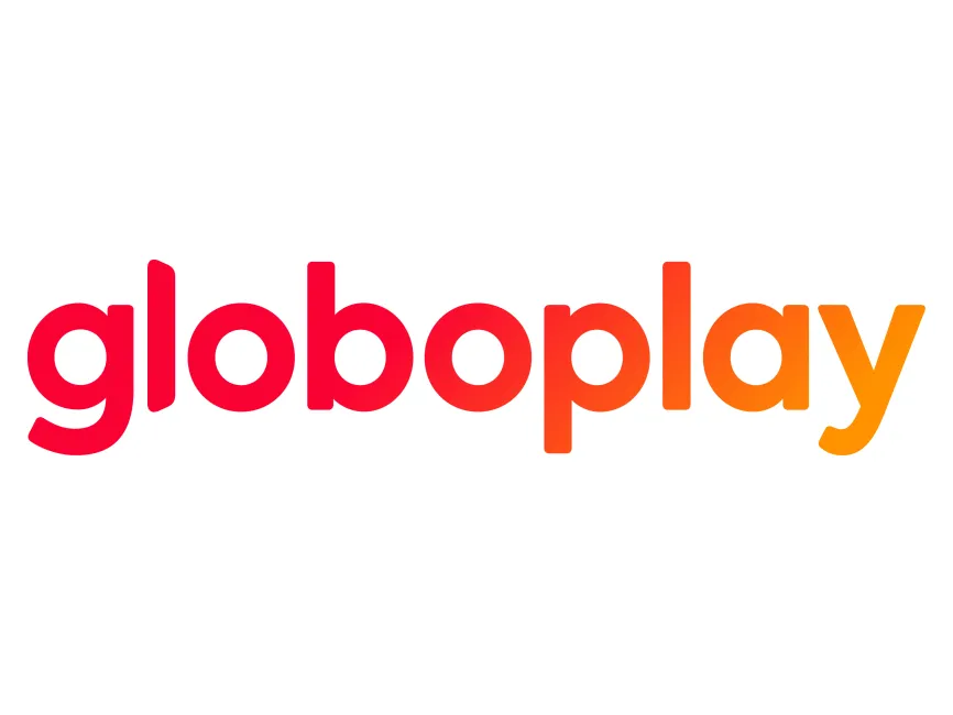
The original Globoplay logo used a bright red color scheme with a simplistic sans-serif typeface, aligning with modern, minimalistic branding standards. Over the years, the logo went through a few design changes to reflect both design trends and strategic shifts in the company's identity.
One significant change came when the logo incorporated a gradient effect, transitioning from red to orange, symbolizing a vibrant, warm, and dynamic experience. This iteration was meant to communicate diversity in content and emotional warmth.
In a recent update, the gradient has been dropped, returning to a solid red color. This change aligns with a design philosophy emphasizing clarity, digital versatility, and brand consistency. Interestingly, this shift resembles the 2018 version of the logo, suggesting a return to simplicity and brand heritage while maintaining a modern feel.
The current Globoplay logo showcases several notable design features:
The logo utilizes a rounded, geometric sans-serif typeface, which gives it a friendly and accessible appearance. The lowercase letters convey approachability, while the consistent stroke weight maintains clarity even in smaller digital applications.
The prior version used a red-to-orange gradient, symbolizing energy, transformation, and creativity. With the removal of the gradient, the solid red reinforces brand confidence and digital readability, optimizing visibility across screens and platforms.
Globoplay’s logo is a wordmark, meaning the brand name itself functions as the logo without any additional iconography. This is particularly effective for digital brands aiming for high recognition and strong typographic identity.
The letter spacing is tight, which gives a cohesive feel, and the rounded edges of each letter mirror the style often seen in streaming and tech platforms—soft, clean, and modern. The letter “y” adds a dynamic closing shape to the wordmark, providing a sense of direction and flow.
The updated Globoplay logo can be downloaded for free in vector formats such as SVG, PDF, AI, and also in transparent PNG via logowik.com, making it suitable for both web and print applications.


