
- Brands Logos
- Logo Templates
- Icons
- Vectors
- Font In Logos
- Blog
Agora S.A. is one of Poland's leading media groups, established in 1989 shortly before the country's transition from communism to democracy. The company played a significant role in shaping independent journalism in post-communist Poland. Agora is best known as the publisher of Gazeta Wyborcza, one of the most influential daily newspapers in Poland. Over the years, the company has expanded into radio broadcasting, cinema (through Helios), outdoor advertising, internet services, and publishing.
Founded by a group of Polish intellectuals and journalists with strong ties to the Solidarity movement, Agora S.A. has always been more than just a media company—it represents democratic values, freedom of speech, and cultural progress in modern Poland.
For over 30 years, Agora S.A. maintained a consistent visual identity that reflected its established presence in Polish media. However, in a strategic move to modernize and reflect its diversified media portfolio, the company unveiled a new logo in 2024. This marks a significant rebranding initiative, aligning the visual identity of the firm with its evolution into a contemporary multimedia enterprise.
The new logo introduces a more minimalistic and geometric design while retaining the recognizable brand name. This change symbolizes the company’s transformation and continued relevance in a digital-first media landscape.
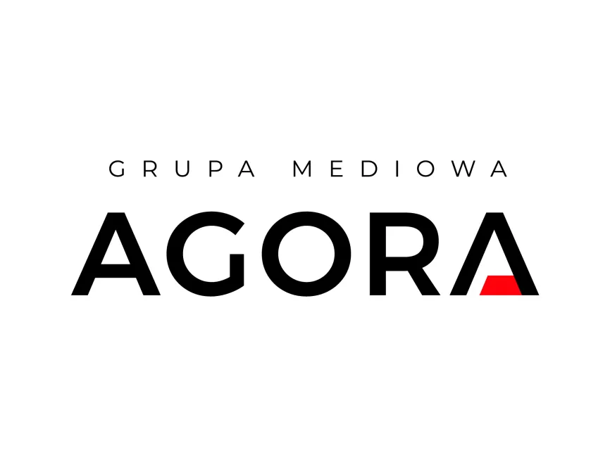
The logo for Agora S.A. is a wordmark logo with subtle symbolic elements. It relies on strong typographic design to communicate brand identity, supplemented by a creative twist in the last letter to create visual impact and recognition.
The typography is bold and sans-serif, projecting modernity, professionalism, and authority. The letters are evenly spaced and well-balanced, conveying clarity and accessibility, which aligns with the company's values of transparent and trustworthy journalism.
The standout feature is the stylized "A" at the end of the word “AGORA,” which has a missing crossbar replaced by a red triangular shape. This design choice is both aesthetic and symbolic.
The color scheme is dominated by black and red, both of which are strong, emotionally resonant choices:
Black: Represents professionalism, strength, and sophistication. It also evokes a sense of legacy and seriousness, fitting for a media company rooted in journalistic integrity.
Red: Introduced in a subtle triangular form within the letter “A,” it adds energy, passion, and a sense of urgency—qualities often associated with breaking news and media dynamics.
The geometric red triangle within the "A" is not just a decorative accent; it subtly references a spotlight or a play button, connecting to Agora's presence in audio-visual media like radio and cinema. The shape also introduces a visual break, giving the logo a dynamic and forward-thinking appearance.
The overall layout, with the subtitle “GRUPA MEDIOWA” in all caps and spaced out above the main name, supports the logo’s authority and scalability. This design choice ensures that the logo can adapt across platforms, from print to digital, billboards to mobile apps.
Agora S.A.’s new logo marks a bold yet refined departure from its historical design. It is a masterful blend of simplicity and symbolism, tailored for a multimedia landscape that spans journalism, broadcasting, and digital innovation. The rebrand reinforces the company’s commitment to evolution while maintaining its core values of integrity, information, and cultural engagement.
The new Agora logo can be downloaded for free in SVG, PDF, AI, and transparent PNG formats from logowik.com for use in professional and creative projects.


