- Brands Logos
- Logo Templates
- Icons
- Vectors
- Font In Logos
- Blog
Harry’s is a U.S.-based men’s grooming brand, best known for offering quality razors and shaving products at affordable prices. The company was founded in 2012 by Jeff Raider and Andy Katz-Mayfield. Raider was also a co-founder of Warby Parker, and the concept behind Harry’s followed a similar direct-to-consumer business model, aiming to disrupt the overpriced razor market dominated by legacy brands.
The idea came from the founders' frustration with expensive and inconvenient razor purchases. Harry’s solution was to offer premium shaving products with sleek design, fair pricing, and a subscription service. In 2014, the company took full control of its production process by acquiring Feintechnik, a German razor blade manufacturer with decades of experience. This vertical integration strategy helped Harry’s ensure consistent product quality and supply chain control.
Today, the brand has expanded its portfolio to include skincare, haircare, and other men’s grooming essentials. Harry’s is also known for its commitment to social impact, pledging to donate a percentage of its profits to organizations that promote mental health and men’s well-being.
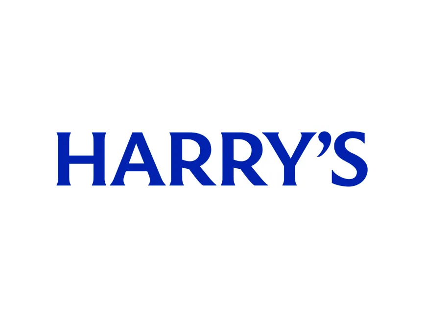
The Harry’s logo is a textbook example of modern minimalism meeting timeless design principles. It consists solely of the brand name “HARRY’S” in a custom serif typeface with a bold, deep blue color.
The typeface used in the Harry’s logo is a customized serif font that balances classic and contemporary elements. The serifs are sharp and confident, suggesting tradition and reliability, while the overall proportions give it a clean and modern feel. The apostrophe between the "Y" and "S" is a small yet distinct design choice that adds character and breaks the monotony of the all-caps format.
The dark blue color communicates professionalism, trust, and calmness. It aligns well with the brand’s values of quality and thoughtful design. Blue also has a universal appeal and is often used by health and personal care brands to convey cleanliness and dependability.
This logo is a typographic wordmark. It contains no icons or embellishments, making it versatile and easy to apply across various platforms, from digital screens to packaging. The boldness of the letters allows for strong brand recognition, even at smaller scales.
By using a simple wordmark, Harry’s emphasizes transparency and trustworthiness. The lack of visual clutter reflects the brand’s no-nonsense approach to grooming. It speaks directly to the modern male consumer who values practicality, quality, and aesthetics.
Since its inception, Harry’s has maintained a consistent visual identity. The logo has not undergone any major redesigns, which reinforces the brand's commitment to reliability and long-term trust. This consistency is strategic, especially for a brand that built its reputation through word-of-mouth and brand loyalty.
The Harry’s logo is available for free download in various vector formats including SVG, PDF, and AI, as well as transparent PNG format from logowik.com. These formats ensure designers and users can use the logo in high resolution across all types of media.
The Harry’s logo reflects everything the brand stands for: clean design, smart choices, and confidence without arrogance. It’s a prime example of how less can indeed be more in branding.