
- Brands Logos
- Logo Templates
- Icons
- Vectors
- Font In Logos
- Blog
Hewlett Packard Enterprise, commonly known as HPE, emerged as an independent enterprise-focused company after splitting from Hewlett-Packard Company in November 2015. HPE specializes in business technology solutions, particularly cloud computing, networking hardware, servers, storage, and services aimed at large enterprises.
Founded on November 1, 2015, following the restructuring of Hewlett-Packard, HPE carries forward the legacy of innovation and technology pioneered by original founders William Hewlett and David Packard.
Initially, Hewlett Packard Enterprise used a minimalist logo that emphasized clarity, straightforwardness, and digital innovation. The original logo featured a green rectangular outline representing precision and structure.
The new 10th-anniversary logo introduces a contemporary rebranding strategy. The refreshed look retains a strong connection to the original but adds bold modernity, highlighting HPE’s journey into its second decade.
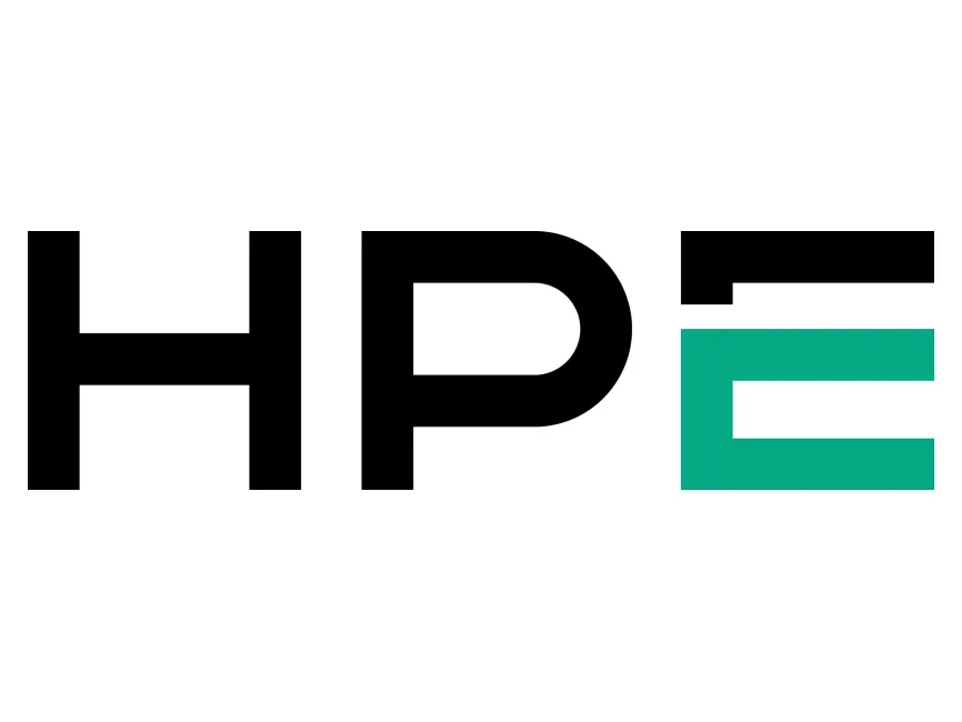
HPE maintains the essential black-and-green palette, ensuring continuity with the brand's established identity:
Black: Represents authority, elegance, and sophistication—aligning with HPE's expertise, trustworthiness, and premium positioning.
Green (Teal accent): Symbolizes innovation, growth, and sustainability—integral to HPE’s technological advancements and eco-conscious operations.
The new wordmark employs bold, sans-serif typography that offers enhanced readability and clear, impactful visual communication:
Simplified Geometric Forms: Letters "H," "P," and "E" are composed of clean geometric shapes, enhancing digital adaptability and clarity across diverse media.
Distinctive Letter "E": The letter “E” is uniquely emphasized with a vibrant teal color block, providing visual emphasis and marking the enterprise focus distinctly from the Hewlett-Packard consumer heritage.
The logo effectively communicates HPE’s identity as:
Stable and Reliable: Solid, heavy lettering conveys robustness, suggesting dependable performance and consistent quality.
Innovative and Adaptive: The dynamic teal "E" introduces innovation visually, distinguishing HPE’s forward-thinking and technology-oriented ethos.
This latest branding approach categorizes the HPE logo as a wordmark (or logotype)—primarily text-based, with a strong, typographic emphasis to ensure clear readability and immediate brand recognition.
HPE’s refreshed wordmark strengthens its brand positioning, aligning visual identity with corporate vision:
Reflects continued commitment to innovation and cutting-edge technologies.
Reinforces corporate image of confidence, expertise, and dynamic adaptability, essential for HPE’s enterprise market segment.
HPE’s 10th-anniversary logo is a well-strategized refinement, marrying heritage with modernity, precision with innovation. The updated visual identity strongly supports the brand’s future-facing mission, ensuring relevance and clear market differentiation.
The Hewlett Packard Enterprise logo is available for free download in high-quality vector formats (SVG, PDF, AI) and transparent PNG via Logowik.com.


