- Brands Logos
- Logo Templates
- Icons
- Vectors
- Font In Logos
- Blog
Lazada is a prominent e-commerce company headquartered in Singapore, serving as a flagship online shopping platform across Southeast Asia. It was founded in 2012 by Rocket Internet with the vision to bring the Amazon model to emerging markets. In 2016, Alibaba Group acquired a majority stake in Lazada, integrating the brand into its global commerce infrastructure. Lazada now operates in six major markets: Indonesia, Malaysia, the Philippines, Singapore, Thailand, and Vietnam.
With a strong focus on logistics, digitalization, and customer satisfaction, Lazada has established itself as a leader in the Southeast Asian digital economy.
Lazada’s logo has evolved to reflect its transformation from a startup e-commerce player to a major regional tech brand. The early versions of the logo featured a simple wordmark with a playful, informal font in blue. After the Alibaba acquisition, Lazada underwent a brand overhaul in 2019, launching a modernized visual identity.
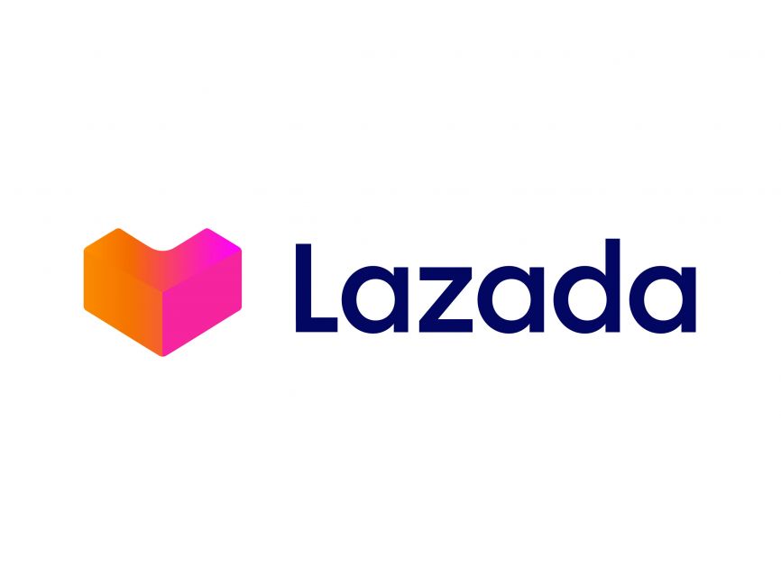
The current logo, which is shown in the image above, marks a significant departure from the earlier iterations. It introduces a bold, abstract heart-shaped icon alongside a refined wordmark. This logo embodies Lazada’s new mission to make online shopping joyful, efficient, and customer-centric.
The Lazada logo is a combination mark, featuring both an abstract icon and a wordmark. This style supports versatility across digital platforms and mobile apps.
The icon is a 3D geometric heart, made from interlocking folded shapes. It cleverly mimics both a package box and a heart, symbolizing Lazada’s dual emphasis on logistics excellence and customer care.
The folded effect gives a sense of depth and movement.
The heart shape communicates trust, warmth, and emotional connection.
The box symbolism represents delivery and e-commerce fulfillment.
This clever blend of emotional and functional symbolism makes the logo both visually engaging and meaningful.
The icon uses a gradient of warm hues—ranging from orange to magenta to pink. This gradient:
Suggests energy, innovation, and youthfulness.
Reflects the diversity of Lazada’s product offerings and user base.
Stands out strongly on digital screens, making it highly recognizable in mobile-first environments.
The wordmark is rendered in dark navy blue, which conveys stability, professionalism, and digital authority. The contrast between the warm icon and cool typography achieves a balanced and modern aesthetic.
The Lazada wordmark features a custom, rounded sans-serif font. Its characteristics include:
Smooth curves and consistent stroke widths, evoking friendliness and approachability.
Lowercase styling that feels modern, informal, and accessible.
Clean spacing and geometric proportions for high readability and brand clarity.
This typeface complements the icon without overpowering it, reinforcing Lazada’s identity as a contemporary, user-friendly tech platform.
The Lazada logo is a strong example of modern brand design in the digital commerce space. It combines emotional resonance (via the heart symbol), functional clarity (via the folded box shape), and modern aesthetics (via color gradient and minimalist typography). As Lazada continues to expand across Southeast Asia, its logo serves as a powerful visual anchor that reinforces trust, innovation, and a delightful shopping experience.
The Lazada logo can be downloaded for free in vector formats such as SVG, PDF, AI, and transparent PNG on logowik.com, making it accessible for designers and brand developers alike.