- Brands Logos
- Logo Templates
- Icons
- Vectors
- Font In Logos
- Blog
Lulu is a global self-publishing platform that empowers creators to publish, print, and distribute their work to a worldwide audience. Founded in 2002 by Bob Young, who also co-founded Red Hat, Lulu.com was designed to disrupt traditional publishing by giving authors full control over their content, profits, and distribution.
Headquartered in Raleigh, North Carolina, Lulu has grown into one of the most recognized names in print-on-demand publishing. It supports various formats, including paperback, hardcover, photo books, calendars, and ebooks. Lulu's model appeals especially to independent authors, educators, entrepreneurs, and creatives who want a cost-effective and scalable publishing solution.
Lulu’s logo has undergone subtle but meaningful changes since its inception. The earlier versions were more playful and casual, reflecting the youthful energy of the early 2000s tech startups. The current logo marks a move toward a more professional and streamlined identity, aligning with Lulu's growing reputation as a serious player in the publishing industry.
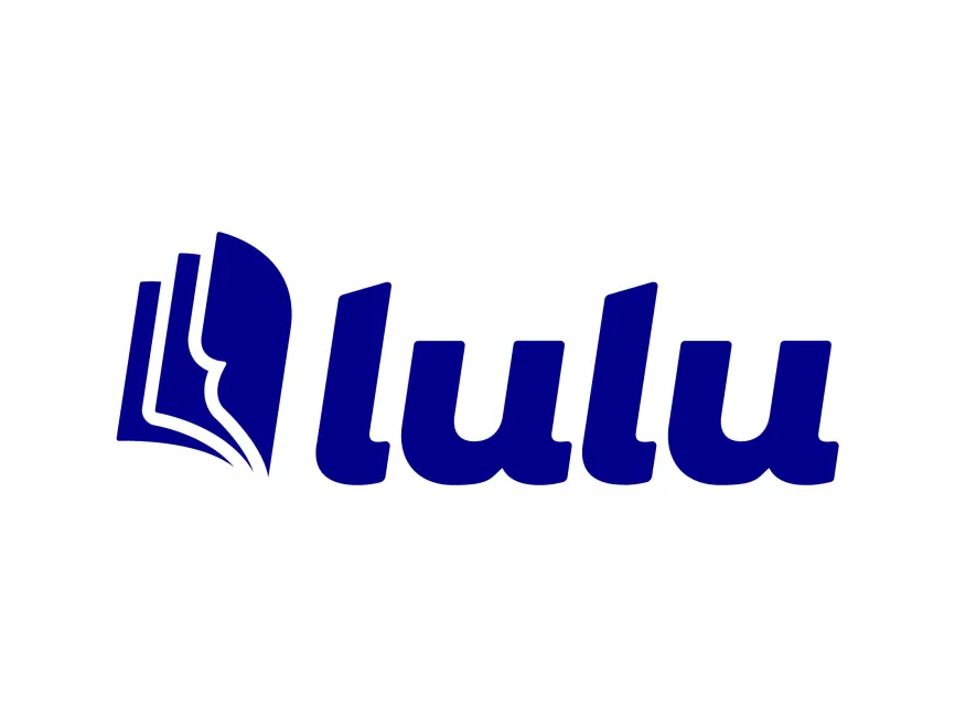
The latest logo features a custom logotype and an abstract icon that embodies the essence of books and publishing. The refined typography and stylized icon suggest trust, clarity, and creative freedom.
The Lulu logo is a combination mark, consisting of both a wordmark and a graphic icon. The typeface is bold, rounded, and sans-serif, which gives the logo a friendly and modern appearance. This visual tone effectively balances professionalism with approachability—a crucial aspect for a brand serving both amateur authors and professional publishers.
The icon to the left of the word “Lulu” cleverly represents an open book, with overlapping pages designed in a dynamic, sweeping motion. This design choice visually communicates Lulu’s core business of book publishing while also symbolizing motion, growth, and creativity. The abstraction is smartly done: it avoids being too literal while still clearly referencing the publishing industry.
The open-book icon also resembles the letter “L”, integrating brand identity into the visual element, which is a hallmark of strong logo design.
The logo is rendered in a deep royal blue, a color often associated with reliability, intelligence, and professionalism. Blue is a common choice in tech and publishing as it exudes trust without being too formal. The consistent use of this single color also enhances versatility and makes the logo adaptable to different formats and backgrounds.
From a design perspective, the Lulu logo is highly effective. It leverages simplicity and clever symbolism to communicate the brand’s purpose while maintaining a clean and modern look. The rounded typeface supports readability and visual friendliness, while the boldness ensures strong presence across print and digital mediums.
The logo scales well, retains clarity in monochrome, and fits seamlessly into app icons, social media, book covers, and other branded materials—an important factor for modern, multi-platform brands.
For designers, marketers, or users who need high-quality Lulu logos for commercial or editorial use, the logo is available for free download on Logowik.com. It can be found in various vector and raster formats including SVG, PDF, AI, and transparent PNG, ensuring flexibility for both digital and print applications.