
- Brands Logos
- Logo Templates
- Icons
- Vectors
- Font In Logos
- Blog
Moonbeam is a smart contract platform built on Polkadot, designed to offer Ethereum-compatible blockchain services. The project was launched by PureStake, a blockchain infrastructure company founded by Derek Yoo. Moonbeam went live on the Polkadot mainnet in January 2022, with the aim of enabling developers to deploy existing Solidity smart contracts and DApp frontends with minimal changes.
Moonbeam stands out as a parachain on the Polkadot ecosystem, enabling cross-chain interoperability while maintaining Ethereum-compatible developer tools and APIs. It supports a variety of use cases including DeFi, NFT marketplaces, and DAO infrastructures.
The Moonbeam logo has evolved from a more illustrative and colorful design (featuring bright cyan, purple, and cosmic-themed elements) to a modern, minimalistic black-and-white version. This transition reflects the broader trend in Web3 branding—moving towards simplicity, professionalism, and strong brand recognition.
The new logo moves away from space-themed fantasy toward a corporate, streamlined identity. This change suggests Moonbeam is positioning itself as a mature, infrastructure-level solution rather than a startup project with experimental roots.
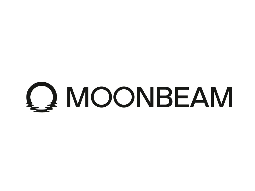
The Moonbeam logo is a combination of a symbol and logotype. It features a circular emblem on the left and the wordmark "MOONBEAM" in clean, geometric sans-serif typography to the right.
The emblem depicts a horizon-shaped moon reflected on water, with the bottom part breaking into wave-like silhouettes. This circular mark can be interpreted both as a setting or rising moon and a symbol of reflection, subtly hinting at mirror networks or compatibility with Ethereum, one of Moonbeam's core offerings.
The new logo uses solid black on a white background, conveying strength, clarity, and modernity. The absence of gradient or color also adds flexibility for multi-platform branding—from whitepapers to Web3 apps.
The monochromatic design promotes trust, stability, and a no-nonsense approach to infrastructure and technology, which aligns with Moonbeam’s technical mission.
The circular shape is a strong, universal design choice representing completeness, cycles, and unity. The reflection lines below the circle offer visual rhythm and also hint at the platform's cross-chain capabilities, as if mirroring Ethereum’s functionality on a new layer.
The water effect adds a natural, organic element to an otherwise highly geometric layout. This balance between organic and geometric forms reflects Moonbeam’s blend of innovation and structure.
The font is clean, uppercase, and sans-serif, projecting confidence and legibility. The uniform stroke width and geometric proportions communicate efficiency and scalability—core attributes for any blockchain infrastructure.
The Moonbeam logo is available in vector formats including SVG, PDF, and AI, as well as in transparent PNG on logowik.com, where it can be downloaded for free. These formats ensure high resolution and adaptability across both digital and print media.
The Moonbeam logo exemplifies how blockchain projects are maturing in their brand communication. It combines minimalist design, strategic symbolism, and high usability. The circular moon with its reflective ripple speaks to Moonbeam’s technical ethos—bringing Ethereum compatibility to the Polkadot ecosystem with seamless elegance.
This logo is a prime example of how strong visual identity can mirror a project's mission and technical architecture.


 Logo")