
- Brands Logos
- Logo Templates
- Icons
- Vectors
- Font In Logos
- Blog
People Inc. is the new corporate name for Dotdash Meredith, the company that owns and operates the iconic People magazine, along with several other major lifestyle and information brands. The transition to the People Inc. name was officially announced in August 2025, marking a strategic shift to unify its publishing legacy under one of its most recognized and powerful brand names: People.
Dotdash Meredith, a combination of Dotdash (a digital publishing company under IAC) and Meredith Corporation (a long-standing media group founded in 1902), was formed in 2021 after Dotdash acquired Meredith. The new name, People Inc., reflects the organization’s commitment to people-centered journalism and content, encompassing areas such as entertainment, health, food, home, and lifestyle.
The move to rebrand as People Inc. aligns the company’s mission more clearly with its core strength—trusted, human-focused media brands—and leverages People as the flagship identity.
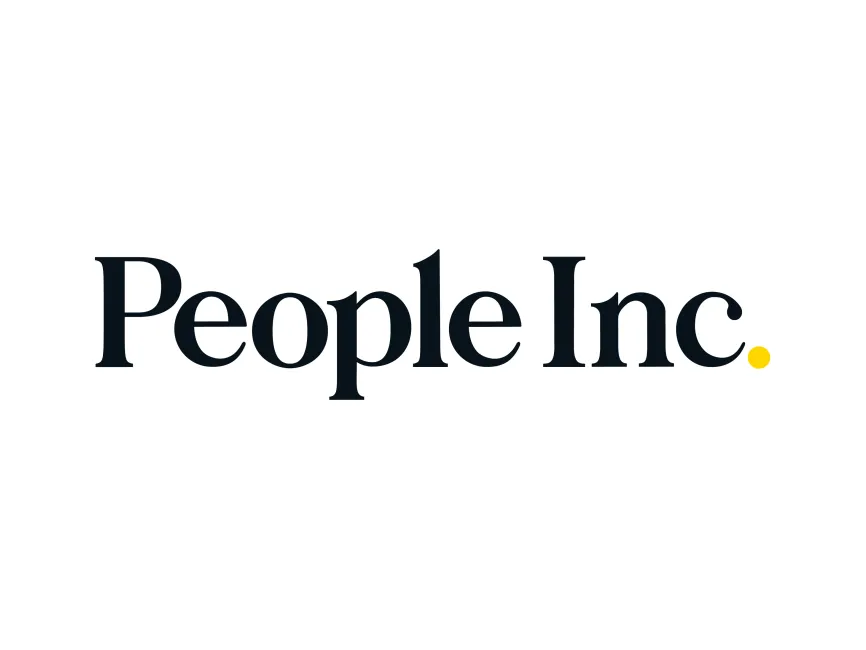
The rebranding from Dotdash Meredith to People Inc. includes a sleek, minimalistic logo that brings a fresh yet classic feel. While Dotdash Meredith employed a more modern and digital-oriented identity, People Inc. has chosen a serif typeface that conveys trust, heritage, and professionalism.
The rebrand is not a complete departure from its legacy but a consolidation and modernization of its identity under one powerful name. The new logo reflects this through its thoughtful simplicity.
The People Inc. logo is a masterclass in typographic branding. It is a wordmark logo, built entirely from the stylization of the name without any accompanying symbol. However, it still achieves distinctiveness and memorability through its refined details.
Typography:
The serif typeface used in "People Inc." balances modernity and tradition. The type has elegant curves, high contrast in stroke weight, and a slightly compressed structure. This choice suggests editorial authority and a premium feel, in line with a media brand rooted in storytelling.
Color:
The primary text is rendered in a deep black, conveying strength and sophistication. The standout design element is the yellow dot at the end of the word "Inc." This small but bold punctuation mark acts almost as a signature—playful, modern, and attention-catching. Yellow symbolizes optimism, creativity, and energy, injecting a hint of warmth into an otherwise formal design.
Design Elements:
The logo is minimalistic, with no graphical icons or embellishments, letting the typography speak entirely for the brand. The dot, however, functions subtly as a brand element that may be expanded into other identity uses across platforms.
Logo Type:
This is a text-based logo (wordmark) that emphasizes clarity and brand recognition. It relies on font and spacing rather than illustrative or abstract components.
The logo's design speaks to the brand’s essence—focused on people, stories, and trust. The serif typeface connects to the company’s rich publishing legacy, while the clean layout and single yellow dot show a confident, modern outlook. It’s an identity that bridges old and new media, honoring a century-old tradition while embracing a digital future.


