
- Brands Logos
- Logo Templates
- Icons
- Vectors
- Font In Logos
- Blog
Proxity is a digital intelligence and defense technology company that provides strategic data insights for government procurement, military forecasting, and global industrial supply chains. Based in the United States, Proxity specializes in federal acquisition tracking, defense market analysis, and competitive intelligence. Its mission is to enable clients—particularly government agencies, contractors, and private enterprises—to make data-driven decisions by leveraging advanced analytics.
Proxity operates at the intersection of technology, national security, and economic intelligence, often serving industries tied to public sector operations and critical infrastructure.
The new Proxity logo marks a distinct shift toward modernity and clarity. Compared to older versions that were more conventional and possibly text-heavy, this updated design uses a sleek, minimalist aesthetic to reflect the company's tech-forward, data-centric identity.
This logo rebrand comes at a time when digital-first brands, particularly those involved in defense tech and SaaS intelligence platforms, are choosing more clean and symbolic wordmarks that scale effectively across digital dashboards, presentations, and mobile applications.
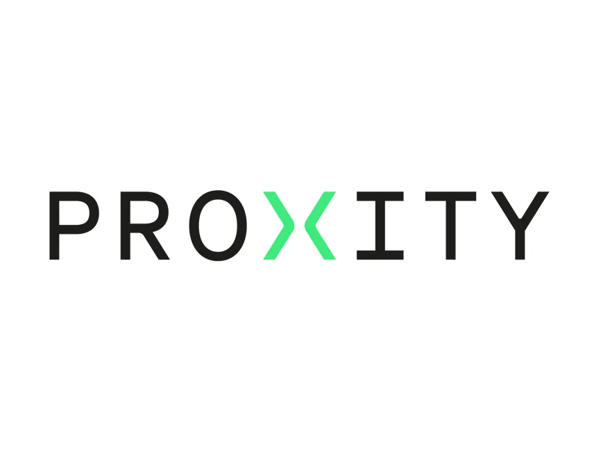
The Proxity logo is a custom wordmark, with a unique twist in the center that sets it apart from a generic typographic identity. The overall design uses a sans-serif font with geometric consistency, while one letter is replaced by a custom symbol—creating a visual and semantic focal point.
This design choice strikes a balance between readability and brand uniqueness, a common approach among tech-driven companies.
The standout feature of the logo is the stylized “X” in the center, rendered in a vivid green hue. Rather than using a traditional "X", the designers have split it into two mirrored chevrons ("> <") facing each other, symbolizing convergence, proximity, and dynamic interaction—concepts that align closely with Proxity’s mission of bringing together disparate data points for strategic insights.
The shape also resembles a connector or data link, reinforcing the brand’s role in linking information across networks and supply chains.
The green color used here represents innovation, technology, and progress, while also drawing attention to the center of the wordmark, guiding the viewer’s eye directly to the core of the brand name—"Proximity".
The surrounding typography is rendered in black, using a simple, modern sans-serif font with even stroke width and balanced spacing. This conveys a tone of professionalism, security, and clarity, which is essential for a brand operating in data intelligence and defense sectors.
The bold yet unembellished look reflects Proxity’s focus on delivering precise and actionable data without unnecessary complexity.
The logo uses a two-color scheme:
Black: Symbolizing authority, trust, and data integrity.
Bright Green (center “X”): Representing innovation, growth, and technological advancement.
The contrast between these two tones not only improves visual hierarchy but also adds a touch of brand personality without undermining professionalism.
The new Proxity logo is available in vector formats such as SVG, AI, and PDF, as well as transparent PNG, on logowik.com. These formats allow for versatile use across digital and print applications with high fidelity and scalability.
The Proxity logo is a masterclass in minimalist brand identity design, especially for a company operating in the fields of data analytics, intelligence, and defense. Its sharp typography, centralized green convergence symbol, and clean layout make it memorable, functional, and representative of its mission.
This logo not only supports strong digital presence but also visually conveys the proximity of insight, the convergence of data, and the strategic connectivity that Proxity offers to its clients.


