- Brands Logos
- Logo Templates
- Icons
- Vectors
- Font In Logos
- Blog
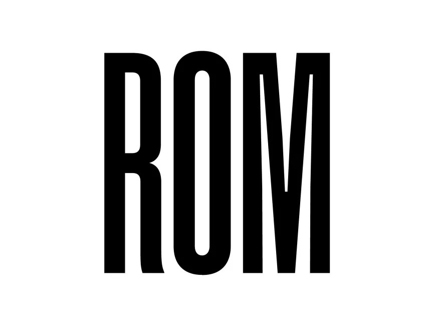
The Royal Ontario Museum (ROM) has unveiled a fresh new logo, marking a shift in its visual identity. This rebranding reflects the museum’s evolving role as a modern, innovative institution while maintaining its rich historical significance. Let's analyze the design of the new ROM logo in detail.
The Royal Ontario Museum (ROM) is one of Canada's most significant cultural institutions. Established in 1914, it is located in Toronto, Ontario, and houses a vast collection of art, world culture, and natural history exhibits. Over the years, ROM has expanded both physically and conceptually, embracing contemporary approaches to museum experiences. This rebranding aligns with its vision for the future.
The new ROM logo features a bold, modern, and minimalist typographic approach. The design consists of the museum's initials, "ROM", in an elongated, compressed sans-serif font. The vertical emphasis of the letters creates a strong, imposing presence, symbolizing stability, legacy, and progress.
The logo is presented in a black-and-white color scheme, enhancing its versatility and timeless appeal.
The new ROM logo moves away from previous iterations that incorporated geometric shapes and vibrant colors. Instead, it embraces a minimalist and typography-focused approach, which is in line with global branding trends.