
- Brands Logos
- Logo Templates
- Icons
- Vectors
- Font In Logos
- Blog
SchoolAI is a forward-thinking educational technology company that aims to revolutionize the classroom experience through artificial intelligence. It provides tools and digital solutions that assist teachers, empower students, and streamline school operations using advanced AI-driven systems. Founded with a mission to enhance learning through smart automation and personalized education tools, SchoolAI positions itself at the intersection of technology and pedagogy.
The company is based in the United States and has gained traction particularly in the K-12 education sector by offering features such as automated lesson planning, AI teaching assistants, student engagement analytics, and more. Its solutions are designed to reduce teacher workload and create more interactive and inclusive learning environments.
As of now, SchoolAI maintains a single, strong brand identity with a modern logo that encapsulates its innovative essence. There is no publicly documented logo redesign history, indicating that the current visual identity was likely crafted with long-term branding in mind. This approach is common among tech startups seeking to establish a consistent presence from the outset.
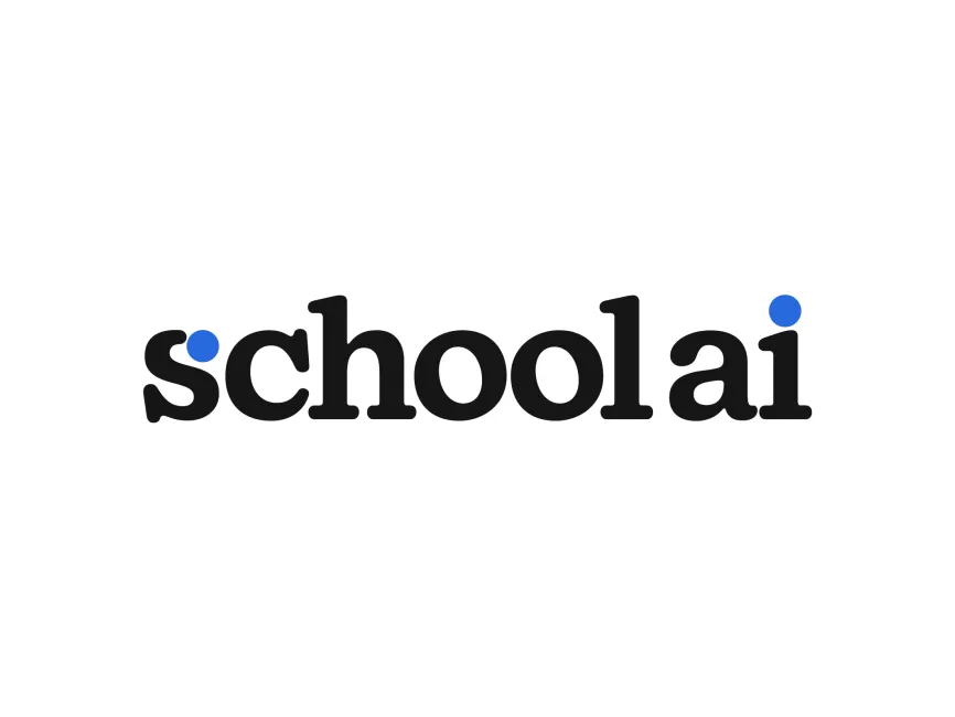
The SchoolAI logo is a wordmark, a type of logo that uses a stylized text version of the company name. Wordmarks are often chosen by newer tech companies to build name recognition while maintaining a clean and memorable look.
The typography used in the SchoolAI logo is soft and rounded with a slightly playful, humanistic feel, which balances professionalism with approachability—key traits for an education-focused brand. The typeface resembles a modified slab serif or transitional serif font, offering a traditional academic aesthetic with a modern twist.
The characters are evenly spaced and bold, enhancing readability and ensuring the brand name is instantly recognizable across digital and print mediums.
The primary color scheme consists of black and a vibrant blue:
Black symbolizes authority, professionalism, and sophistication. It's a grounded color choice that reinforces trust and reliability—important values for an educational service.
Blue, specifically a vivid royal blue, is used in two distinct circular accents: the dot over the "i" and a dot inside the "s". Blue traditionally represents intelligence, innovation, and calm—qualities essential in both tech and education. These blue dots also add a visual rhythm and emphasis at the start and end of the wordmark, subtly drawing attention to the core components: "school" and "AI".
The most unique design feature in the SchoolAI logo is the use of two circular blue dots. These dots not only serve a functional typographic purpose (as the dot of the "i" and an abstract addition to the "s") but also add a distinctive, memorable flair. Circles often represent unity, continuity, and wholeness—all important themes in the educational experience.
There are no complex graphical elements, which aligns with the minimalist design trends in modern tech branding. The simplicity allows the logo to scale effectively and maintain clarity in various applications, from websites to mobile apps.
The SchoolAI logo is a well-balanced combination of modernity and tradition. It effectively communicates the brand’s identity—an educational platform enhanced by cutting-edge AI—through simple yet thoughtful design choices. The contrast of bold black text with minimal blue accents creates visual interest while maintaining a professional appearance. Its clarity, symmetry, and smart use of color make it instantly recognizable and suitable for various use cases in digital and physical formats.
The SchoolAI logo is available in vector formats such as SVG, PDF, AI, and also as transparent PNG files. These can be downloaded for free from logowik.com, making it convenient for designers, media professionals, and educators who want to include the brand in promotional or collaborative materials.
This logo stands out in the growing edtech industry by seamlessly merging educational symbolism with tech-forward design principles.


