
- Brands Logos
- Logo Templates
- Icons
- Vectors
- Font In Logos
- Blog
Shutterstock is a globally recognized provider of stock photography, video footage, music, and editing tools, widely used by creatives, media organizations, and businesses. The company was founded in 2003 by Jon Oringer in New York City. Oringer initially launched the platform with 30,000 of his own photographs and established a subscription-based model that revolutionized how digital assets were accessed online.
Since its inception, Shutterstock has grown into one of the largest content marketplaces in the world, offering millions of royalty-free assets and employing cutting-edge technologies like AI to enhance content discovery and licensing.
Shutterstock has undergone several logo changes throughout its history, each reflecting a shift in the brand’s visual identity and corporate direction. Earlier versions featured red and white palettes and a more traditional typeface. In the mid-2010s, the brand adopted a minimalist style with lowercase letters and a red square to signify its digital-first nature and creativity.
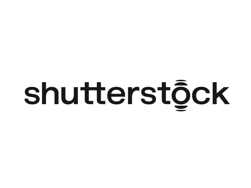
In 2025, Shutterstock introduced a refreshed logo that marks a bold step forward in its branding strategy. The new design eliminates the red square entirely and embraces a more conceptual and modern aesthetic.
The 2025 Shutterstock logo is a typographic design that leverages simplicity and symbolism to communicate the brand’s evolving role in the digital creative economy.
The typeface remains lowercase and sans-serif, maintaining a modern, approachable, and clean look. The use of bold lettering reinforces the brand's confidence and authority in the visual content space. The new design places emphasis on clarity and scalability, essential for digital and mobile-first environments.
The most striking change is the redesigned "o" in "shutterstock". It now resembles a circular lens or soundwave icon, with curved lines radiating above and below. This shape may symbolize several ideas:
A camera lens, hinting at the core photography and visual focus of the platform.
A soundwave or digital ripple, emphasizing Shutterstock's expansion into music, video, and AI-driven tools.
A hub or portal, representing Shutterstock as a creative gateway.
This multi-layered symbolism adds depth to an otherwise minimalist logo.
The logo is now presented entirely in black, a deliberate choice to create a neutral, professional, and adaptable identity. Black signifies strength, elegance, and sophistication. Without the red element, the logo aligns more with modern design trends that prioritize functional aesthetics over overt branding colors.
This is a wordmark logo with a symbolic typographic modification. The stylized "o" introduces a logotype-symbol hybrid, combining the simplicity of a wordmark with the uniqueness of a custom icon.
The use of curved lines around the "o" adds motion and energy to the design, subtly reinforcing Shutterstock’s role as a dynamic platform for creatives.
The 2025 Shutterstock logo is a sophisticated redesign that encapsulates the platform's evolution from a stock photo provider to a comprehensive creative ecosystem. Its minimalistic yet symbolic design speaks to the future of content creation—one where clarity, adaptability, and digital relevance are paramount.
The new Shutterstock logo can be downloaded for free in vector formats such as SVG, PDF, AI, and transparent PNG from logowik.com.


