
- Brands Logos
- Logo Templates
- Icons
- Vectors
- Font In Logos
- Blog
SmartBear is a well-established software company based in Somerville, Massachusetts, USA. The company was founded in 2009 and has grown to become a global leader in software development tools. SmartBear is best known for its powerful products that support the full software development lifecycle, including API testing (like SoapUI and ReadyAPI), performance testing, code collaboration, test management, and monitoring. Its tools are widely adopted across industries due to their scalability, integration capabilities, and user-friendly interfaces.
SmartBear’s mission is to empower developers, testers, and engineers to build, test, and deliver high-quality software faster. The company supports millions of users worldwide and plays a key role in DevOps and Agile development practices.
Over the years, the SmartBear logo has undergone subtle changes to reflect the brand’s evolution from a startup into a robust, enterprise-grade software provider. The previous versions of the logo were more illustrative and had a technical look, whereas the current version is minimal, bold, and modern—representing clarity, professionalism, and innovation.
The current logo demonstrates a strategic design shift to communicate simplicity, reliability, and tech-forward thinking, in line with contemporary design trends that emphasize clean lines and symbolic geometry.
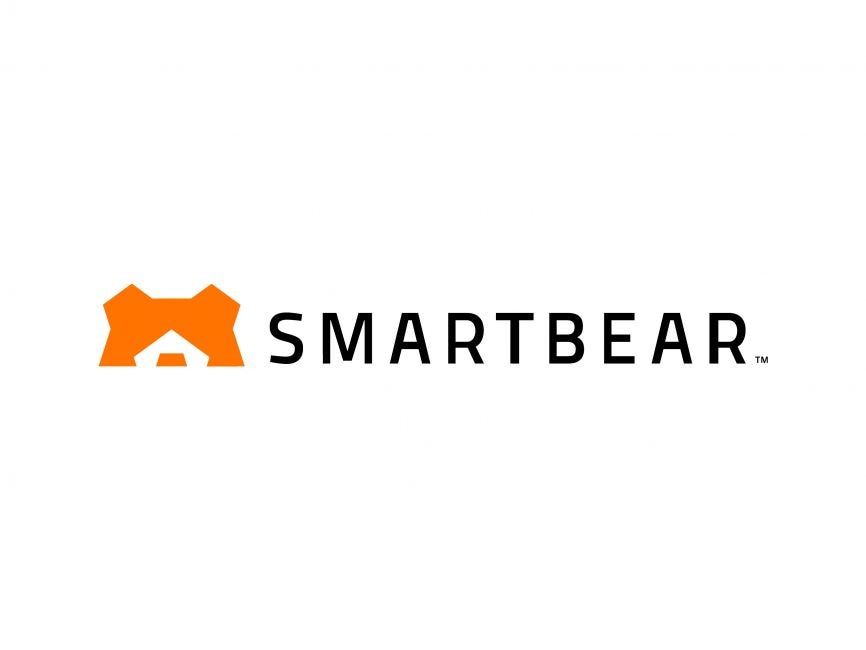
The SmartBear logo consists of two primary elements: a stylized geometric bear head and the brand name "SMARTBEAR" in uppercase sans-serif typography.
The orange symbol is a minimalist representation of a bear’s head. It uses angular, geometric shapes to create the impression of ears and a snout, formed by a central negative space. This clever use of negative space forms a stylized face, which is both creative and iconic. The bear, as an animal, symbolizes strength, intelligence, and resilience—all values associated with high-performing software.
The color orange in the logo symbolizes energy, creativity, and enthusiasm—key attributes for a company that enables rapid, agile development and innovation.
The typography is a modern, sans-serif typeface with ample spacing between letters. The all-caps format conveys authority and confidence. Its simplicity pairs well with the intricate bear icon, balancing visual interest with readability and professionalism.
The SmartBear logo can be categorized as a combination mark, which means it includes both a text and a symbol. This type of logo is versatile, making it recognizable even when the text is separated from the symbol. The minimalistic design fits well in both digital and print media, which is critical for a tech company with a strong online presence.
SmartBear’s visual branding communicates trust, intelligence, and approachability. The bear element introduces personality into what could otherwise be a purely technical identity. The minimal design ensures scalability and legibility at all sizes—ideal for use on websites, applications, and documentation.
The choice of a bright, engaging color like orange suggests a dynamic and customer-friendly approach, while the sharp edges and geometry reflect precision and technical excellence.
SmartBear’s logo is available for free download in vector formats such as SVG, AI, and PDF, as well as transparent PNG format from logowik.com. These formats are ideal for both web and print usage, maintaining quality across various mediums.
SmartBear’s logo is a prime example of effective branding in the tech industry—melding symbolism, modern typography, and strategic color use into a cohesive and powerful visual identity.


