Strategy is the new name for MicroStrategy, a leading enterprise business intelligence, analytics, and Bitcoin adoption company. Originally founded in 1989 by Michael J. Saylor, MicroStrategy has been a pioneer in data analytics, cloud-based intelligence solutions, and Bitcoin integration for corporate finance.
The rebranding to Strategy reflects a modern, streamlined identity, likely aimed at reinforcing the company's commitment to both business intelligence and Bitcoin-driven financial strategies.
Rebranding from MicroStrategy to Strategy
- The name "MicroStrategy" has been shortened to "Strategy", signaling a more focused, bold, and progressive brand identity.
- The shift aligns with the company's growing emphasis on Bitcoin (BTC) as a core financial strategy, alongside its traditional business intelligence solutions.
- The new brand identity strengthens the connection between technology, data-driven decision-making, and digital assets like Bitcoin.
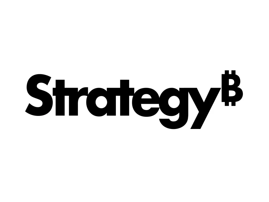
Analysis of the New Strategy Logo
Typography & Font Choice
- The logo uses a modern, bold, sans-serif typeface, reflecting strength, authority, and confidence.
- The letters are thick and well-spaced, ensuring high readability and impact.
- The font choice is simple yet powerful, making it adaptable across digital and corporate branding.
Bitcoin Symbol (₿) Integration
- The most notable change is the integration of the Bitcoin symbol (₿) at the end of "Strategy", reinforcing the company’s strong association with Bitcoin investments.
- The placement of the ₿ at the top-right corner of the letter "y" makes it look like a trademark or superscript, subtly yet effectively conveying that Bitcoin is central to the brand’s identity.
- This unique modification strengthens the company's position as a Bitcoin-focused business intelligence leader.
Color Choice & Design Simplicity
- The logo is entirely black, a color that conveys authority, professionalism, and modernity.
- The monochrome design ensures versatility and adaptability, making the logo effective across digital platforms, business presentations, and branding materials.
- The minimalistic approach removes unnecessary complexity, aligning with the clean and data-driven nature of the company.
Logo Type & Versatility
- The wordmark logo (text-based logo) ensures maximum brand recognition without the need for additional symbols or icons.
- The Bitcoin symbol (₿) addition makes it unique and instantly recognizable, setting Strategy apart from traditional business intelligence brands.
- The minimalistic yet bold design makes it perfect for use in web, print, social media, and corporate branding.
The Strategy rebrand is a strategic and symbolic evolution that reflects the company’s dual focus on business intelligence and Bitcoin adoption. The bold typography, clean design, and Bitcoin symbol integration make it a powerful, modern, and highly recognizable brand identity.
Download Strategy Logo
The Strategy logo is available for free download in vector formats such as SVG, PDF, AI, and transparent PNG on Logowik.com.