- Brands Logos
- Logo Templates
- Icons
- Vectors
- Font In Logos
- Blog
Superside is a leading creative-as-a-service (CaaS) platform that offers scalable design and creative solutions for fast-growing companies and global enterprises. Founded in 2015 by Fredrik Thomassen, the company has reimagined the traditional design agency model by offering subscription-based access to a global team of designers, project managers, and creatives.
Superside serves companies such as Amazon, Salesforce, Meta, Shopify, and Spotify by providing high-quality creative production in areas like brand design, advertising, motion graphics, presentation design, and UX/UI.
Headquartered in the United States but operating with a fully remote, globally distributed team, Superside is revolutionizing how businesses scale creative operations without hiring in-house.
The new Superside logo marks a refreshing departure from more corporate or structured branding styles. Previously, the logo followed a more neutral typographic treatment. The latest redesign focuses on vibrant personality and playful expression, signaling a stronger identity aligned with creativity, fluidity, and approachability.
This change is strategic, reflecting the company’s maturation into a design-driven tech brand that serves as both a service provider and a creative partner.
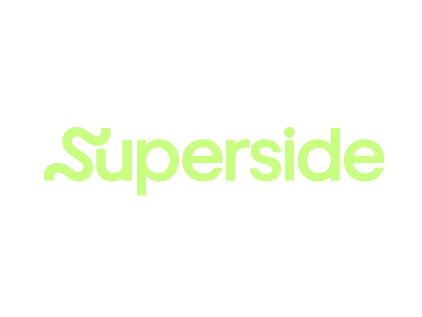
The Superside logo is a typographic wordmark with a strong focus on customization. There’s no accompanying symbol or icon—instead, the unique treatment of the first letter “S” serves as the visual anchor of the brand.
This approach keeps the logo clean and modern while ensuring distinctiveness through subtle but memorable typographic details.
The most eye-catching element of the Superside logo is the custom, wavy “S” that starts the wordmark. Its exaggerated curves and playful flow immediately convey movement, creativity, and flexibility—all core aspects of the services Superside offers.
This custom character adds personality and makes the logo instantly recognizable. The soft, undulating form of the “S” also suggests freedom, fluid collaboration, and dynamic design thinking—ideal traits for a platform built around scaling creative work.
The rest of the logotype is based on a rounded, geometric sans-serif font, likely customized for brand cohesion. The lowercase letters enhance the approachable, modern aesthetic, while maintaining a high degree of legibility.
The uniform stroke widths and balanced letter spacing reflect clarity, professionalism, and simplicity, ensuring the logo functions well across platforms—from web and mobile to large-scale display.
The logo uses a single, neon green or lime tone, which is highly modern, fresh, and vibrant. This bright hue immediately grabs attention and communicates energy, innovation, and originality—qualities that set Superside apart in the creative industry.
Green is also often associated with growth and vitality, reinforcing the brand’s role in helping clients scale creative operations quickly and efficiently.
The logo’s tone is clearly forward-thinking, playful, and professional, mirroring Superside’s hybrid identity as a creative powerhouse and scalable tech-enabled service provider. It successfully straddles the line between startup boldness and enterprise-grade trustworthiness.
The new Superside logo can be downloaded in vector formats (SVG, PDF, AI) and transparent PNG from logowik.com for free. These formats ensure high-quality reproduction across digital and physical applications, making it easy for designers and brand teams to implement consistently.
The new Superside logo is a bold and thoughtful rebrand that perfectly captures the essence of a company built on creative excellence and scalability. The custom “S” adds a spark of originality, while the bright color and modern font communicate accessibility and professionalism.
It is a standout example of how design-led tech companies can use branding to differentiate themselves in an increasingly competitive creative marketplace—balancing style, simplicity, and substance in one cohesive visual identity.