- Brands Logos
- Logo Templates
- Icons
- Vectors
- Font In Logos
- Blog
Toca Boca is a Swedish digital toy company that specializes in developing fun and educational mobile applications for children. Founded in 2010 as a part of Bonnier Group, the company quickly gained global recognition for its innovative and child-friendly approach to digital play. Toca Boca’s apps encourage creativity, exploration, and imagination, making them popular among kids and parents alike.
Since its inception, Toca Boca has maintained a visually appealing and playful brand identity. The logo has remained relatively consistent, reflecting the company's core values of fun, inclusivity, and creativity. While minor refinements have been made over time, the brand has stayed true to its colorful and friendly visual aesthetic.
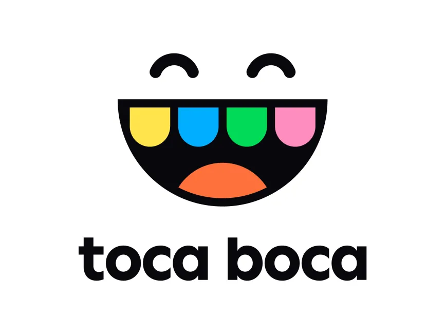
The Toca Boca logo is a smiling face with exaggerated features, resembling a childlike expression of joy. The mouth is a semi-circle filled with vibrant, rounded teeth-like shapes, creating a fun and engaging look. The curved eyes add a sense of happiness and playfulness, reinforcing the brand’s kid-friendly nature.
The logo uses a bright, multi-color palette with yellow, blue, green, pink, orange, and black. Each color represents different aspects of playfulness and creativity:
Below the logo, the brand name "Toca Boca" is written in a bold, lowercase, sans-serif font. The typography is modern, rounded, and simple, ensuring readability while maintaining a friendly and playful feel. The black color of the text provides a strong contrast to the vibrant colors above, enhancing brand recognition.
The Toca Boca logo is a perfect representation of the brand’s mission—creating joyful and imaginative digital experiences for children. The combination of playful shapes, bright colors, and simple typography makes it both visually appealing and effective in conveying the brand’s essence.
Toca Boca's logo is available for free download in vector formats such as SVG, PDF, AI, and transparent PNG on logowik.com.