- Brands Logos
- Logo Templates
- Icons
- Vectors
- Font In Logos
- Blog
TÜV SÜD is one of the world's leading technical service providers, offering testing, certification, auditing, inspection, and training services. The company is headquartered in Munich, Germany, and was originally founded in 1866 as part of a regional initiative to improve safety in steam boiler operations. The acronym "TÜV" stands for Technischer Überwachungsverein, meaning Technical Inspection Association. TÜV SÜD emerged as one of the key TÜV organizations that evolved from this early network, focusing on safety, security, and sustainability solutions across a broad range of industries.
The company operates globally, with a presence in more than 1,000 locations worldwide, and serves industries such as automotive, manufacturing, energy, healthcare, and infrastructure. TÜV SÜD is known for its reliability, trustworthiness, and commitment to high technical standards.
The TÜV SÜD logo has maintained its core visual identity over time, rooted in precision, safety, and authority. While the visual styling has been refined with modern digital-friendly touches, the essential structure—featuring the iconic octagonal shape and deep blue hues—remains consistent. These consistent visual elements help reinforce the brand’s long-standing credibility in the certification and testing domain.
There is no record of dramatic logo redesigns in TÜV SÜD’s history, which reflects the brand’s preference for consistency, trust, and heritage—crucial values in the safety and standards industry.
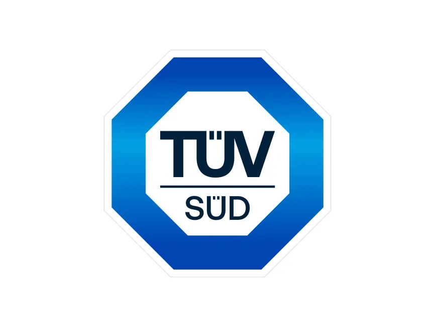
The TÜV SÜD logo is defined by its distinctive octagonal shape, which strongly resembles a stop sign—a subtle and effective visual metaphor for control, safety, and caution. This is especially fitting for a company dedicated to ensuring safety standards in engineering, transportation, and industry.
The octagon encloses the company name in bold, sans-serif typography. The structure consists of two layers: an outer gradient blue octagon and a white inner octagon that frames the text.
The typography used is bold, geometric, and modern, suggesting strength and precision. The use of capital letters enhances visibility and communicates authority. The umlaut (ü) in "TÜV" and "SÜD" is preserved, which not only retains linguistic accuracy but also underlines the company’s German roots—a signal of engineering excellence and thoroughness.
The line separating "TÜV" and "SÜD" adds a visual distinction, supporting readability and visual balance.
The dominant blue gradient is a strategic color choice. Blue is globally associated with trust, professionalism, reliability, and technical expertise—all qualities that define TÜV SÜD’s mission. The gradient gives a sense of depth and modernity, distinguishing the brand in both print and digital environments.
The use of white space ensures clarity and minimalism, allowing the logo to maintain legibility across various applications and backgrounds.
The TÜV SÜD logo is a combination mark, incorporating both a wordmark and a geometric emblem. The octagon serves as a standalone symbol recognizable even without the text, making it versatile for certifications, reports, and signage.
The TÜV SÜD logo is a strong example of effective corporate branding in the safety and standards industry. Its stable and recognizable design reinforces the brand's authority, precision, and engineering heritage. With minimal changes over time, the logo has stood as a symbol of technical integrity and German reliability.
For designers and brand strategists, the TÜV SÜD logo demonstrates how consistent geometry, culturally appropriate typography, and trusted color schemes can combine to create an enduring visual identity.
You can download the TÜV SÜD logo in vector formats such as SVG, PDF, AI, as well as in transparent PNG from logowik.com free of charge.