
- Brands Logos
- Logo Templates
- Icons
- Vectors
- Font In Logos
- Blog
Zippykind is a software-as-a-service (SaaS) platform tailored for businesses that rely on last-mile delivery. It provides powerful tools for managing, tracking, and optimizing delivery operations in real time. Zippykind enables businesses to streamline logistics with features such as delivery route optimization, customer notifications, driver tracking, and delivery analytics.
Founded with the mission to simplify the delivery process for both drivers and companies, Zippykind has positioned itself as a practical and user-friendly solution in the logistics and courier service sectors. The platform is commonly used by small to medium-sized businesses across various industries such as food delivery, retail, and service-based companies.
The Zippykind logo has maintained a consistent style since the company’s inception. Rather than evolving through multiple rebranding phases, the logo has preserved its clean, functional, and tech-driven appearance. This consistency reflects the brand’s reliability and focus on simplicity and efficiency. The use of a car icon has been a central element, instantly conveying its core service: delivery.
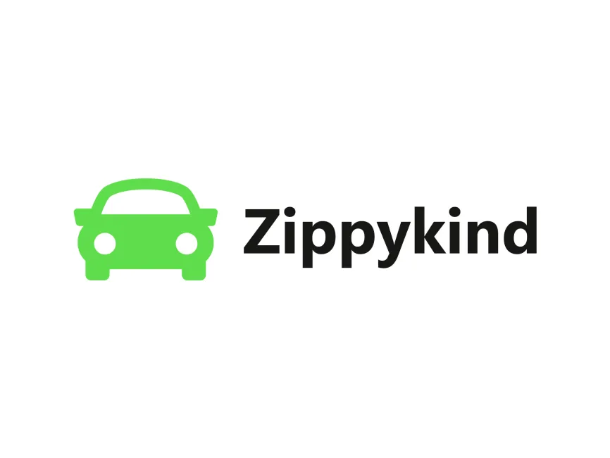
The Zippykind logo combines iconography and typography to deliver a clear and effective visual identity. Here's a breakdown of its components:
The logo uses a combination mark – it includes both a symbol and wordmark. The design places a green car icon to the left of the bold, black logotype "Zippykind". This structure ensures strong brand recognition across different mediums and platforms.
The vibrant green color of the car icon suggests growth, innovation, and eco-consciousness – qualities that align with modern delivery and logistics solutions. Green also evokes trust and friendliness, which are key for customer-facing service apps. The black typography complements the green by providing contrast and reinforcing a sense of professionalism and reliability.
The font used in the wordmark is a modern, sans-serif typeface, possibly customized for uniqueness. The lowercase characters contribute to a more approachable and tech-savvy image, while the bold weight ensures visibility and brand presence.
The car icon is minimalist and stylized, directly symbolizing the core functionality of the service: deliveries. The icon is symmetrical and rounded, giving it a clean and user-friendly appearance. The circular headlights add a touch of personality and playfulness, softening the overall visual.
The logo is optimized for both digital and print use. Its simple form ensures high scalability and adaptability, working equally well on mobile apps, websites, uniforms, and vehicles. The clean lines and solid shapes make it easy to reproduce in various formats and sizes.
The Zippykind logo is available for free download in vector formats such as SVG, PDF, AI, as well as transparent PNG from logowik.com. These formats are ideal for professional use across branding materials.
The Zippykind logo effectively communicates the brand’s values of speed, innovation, and user-friendly delivery service. With its clean design, modern typography, and vibrant color palette, the logo stands out in the SaaS and logistics industry. Its simplicity and clarity make it an excellent example of a strong and practical brand identity.


