
- Brands Logos
- Logo Templates
- Icons
- Vectors
- Font In Logos
- Blog
Bay FC, officially known as Bay Football Club, is a professional women's soccer team based in the San Francisco Bay Area, California. The club was founded in 2023 and began competing in the National Women's Soccer League (NWSL) in 2024. Bay FC was established by an impressive ownership group that includes former U.S. Women’s National Team stars Brandi Chastain, Aly Wagner, Danielle Slaton, and Leslie Osborne, alongside investment firm Sixth Street. The founding of Bay FC represents a significant milestone for women’s sports in Northern California, aiming to inspire new generations and elevate the profile of women’s football on the West Coast.
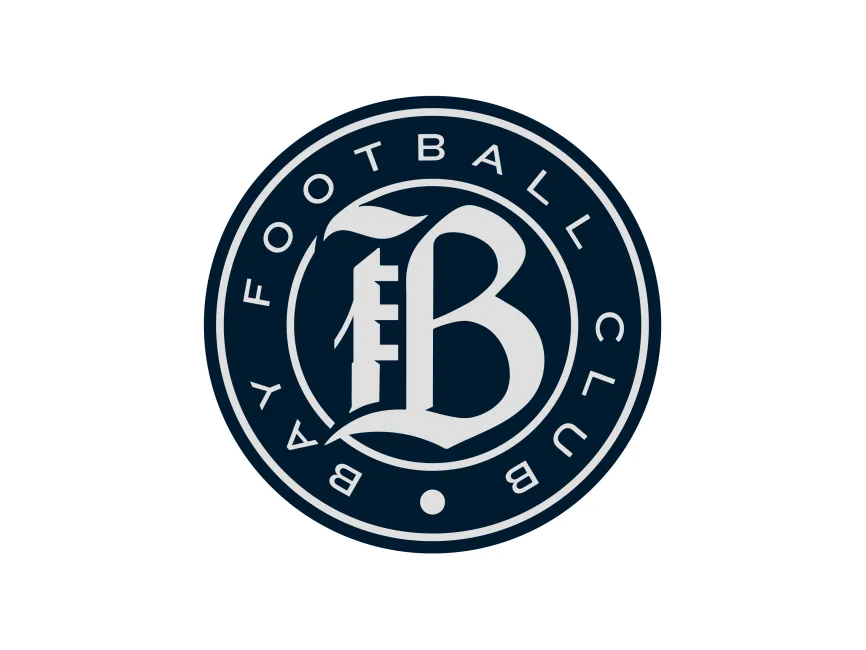
As a new club, Bay FC introduced its first-ever logo ahead of its inaugural season. The logo serves as a central part of the club’s identity, designed to stand out among other teams in the NWSL and to represent the rich, diverse culture of the Bay Area. Since its foundation is recent, there is no historical progression of logos for Bay FC; instead, this initial mark is carefully crafted to set a lasting and powerful tone for the brand from the very beginning.
From a design perspective, the Bay FC logo is a strong example of classic sports branding with a modern twist. The logo is circular, a traditional format in football (soccer) crests that suggests unity, community, and wholeness. The main visual focus is the large, stylized "B" at the center, which uses a blackletter-inspired typeface. This choice of typography hints at both heritage and strength, giving the club an instantly recognizable mark that feels rooted and authoritative.
The monochromatic color palette of navy blue and silver-grey conveys sophistication, trust, and professionalism, aligning well with the club’s ambitions and the premium feel of the Bay Area. The use of only two colors keeps the design clean and versatile, ensuring it looks sharp on kits, merchandise, and digital media.
Surrounding the central "B," the club’s full name—“BAY FOOTBALL CLUB”—is set in a simple, modern sans-serif font, arranged around the inner edge of the circular badge. This contrast between the ornate central letter and the minimalist outer text creates visual interest and ensures clarity. The dot at the bottom of the circle acts as a subtle design anchor, balancing the composition and evoking a sense of completeness.
Bay FC’s logo is a perfect example of a monogram emblem, utilizing the initial letter "B" to represent both the club and the Bay Area itself. The stylized "B" is designed to be both elegant and bold, capturing the forward-thinking, innovative spirit of the Bay Area while nodding to classic sports insignia.
The circular form represents inclusivity and unity—values that are key to the team’s mission of community engagement and inspiration. The use of navy blue references the deep waters of the San Francisco Bay, creating a strong geographic link, while the grey adds a touch of modernity and sleekness.
The Bay FC logo is available for free download in various vector and transparent formats such as SVG, PDF, AI, and transparent PNG from logowik.com. These formats make it easy for designers, fans, and media to use the logo across both digital and print platforms with high quality and flexibility.
Bay FC’s logo is a sophisticated and memorable introduction for a new NWSL club, combining classic football aesthetics with modern design sensibilities. The badge’s elegant "B," circular structure, and refined color palette instantly communicate strength, community, and pride, positioning Bay FC as a bold new force in American women’s soccer. As the club begins its journey, this logo will serve as a powerful visual ambassador for both the team and the vibrant Bay Area community it represents.


