
- Brands Logos
- Logo Templates
- Icons
- Vectors
- Font In Logos
- Blog
Eggo is a popular brand of frozen waffles owned by the Kellogg Company, a global leader in the breakfast and snack food industry. Eggo was first introduced in 1953 by Frank Dorsa, who, along with his brothers, developed a unique waffle batter and a revolutionary process for cooking and freezing waffles for mass consumption. Originally called "Froffles" (a combination of "frozen" and "waffles"), the product was renamed "Eggo" in 1955, referencing the eggy taste of the batter.
Eggo gained massive popularity in the U.S., especially during the 1970s and 1980s, thanks to its iconic slogan “L’eggo My Eggo.” Today, Eggo is a staple in American households and offers various waffle flavors, pancake products, and even breakfast sandwiches.
The Eggo logo has gone through several changes over the decades, evolving to reflect both design trends and the brand’s consumer-focused image. Earlier versions of the logo were more restrained, using simpler, more traditional typography. Over time, the logo has become bolder, more playful, and more stylized—perfectly matching the product's light-hearted and family-oriented branding.
The most recent redesign presents a clean, vibrant, and contemporary look, while maintaining visual continuity with the brand's heritage.
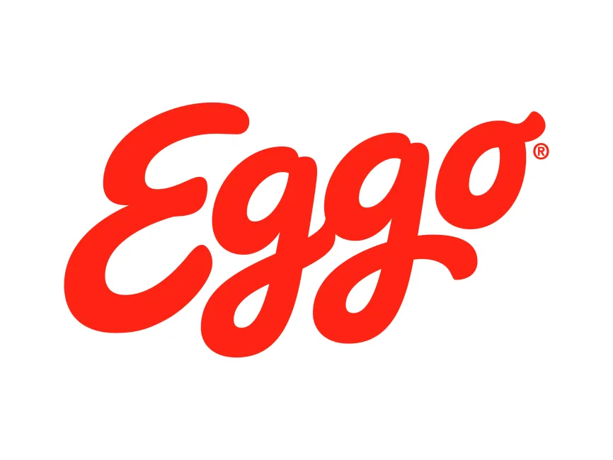
The Eggo logo features a bright red, script-style wordmark that communicates warmth, energy, and approachability. Here's a breakdown of the key design elements:
Typography:
The script-style typeface is custom and playful, mimicking the fluid motion of syrup being drizzled or the whimsical nature of breakfast time. The interconnected letters add to the logo’s friendly and fun appeal. The thick curves and rounded shapes evoke comfort and familiarity—key emotions tied to morning routines.
Color Scheme:
Red is the dominant color in the Eggo logo. Red is a powerful and energetic color often associated with appetite and food branding. Its high visibility on packaging makes it ideal for grocery store shelves. The choice of a single, vibrant color also enhances brand recognition and visual simplicity.
Logo Type:
This is a wordmark logo, where the brand name itself is the central visual identity. The use of a custom script font adds uniqueness and character. This typographic style allows the brand to be instantly recognizable, even without any accompanying imagery or icons.
Visual Tone and Personality:
The overall design conveys a sense of fun, tradition, and reliability. It appeals to both children and adults, striking a nostalgic chord for those who grew up with the brand while remaining fresh and current for new consumers.
The Eggo logo is available in various professional design formats, including SVG, PDF, AI, and transparent PNG. These can be freely downloaded from logowik.com for design, educational, or branding analysis purposes.


