
- Brands Logos
- Logo Templates
- Icons
- Vectors
- Font In Logos
- Blog
QIMR Berghofer Medical Research Institute is one of Australia’s leading medical research institutions. Located in Brisbane, Queensland, it was originally founded in 1945 as the Queensland Institute of Medical Research (QIMR). The organization focuses on translational health research in areas such as cancer, infectious diseases, mental health, and chronic disorders.
In 2013, the institute was renamed to QIMR Berghofer in recognition of a substantial philanthropic donation from businessman and philanthropist Clive Berghofer. This renaming reflected a new era for the institute, bolstering its international profile and expanding its research capacity.
The logo of QIMR Berghofer has undergone a transformation to better reflect the institute’s modern and innovative research focus. The most recent redesign marks a shift from traditional institutional aesthetics to a cleaner, more dynamic and engaging identity.
The previous logo leaned on a classic scientific emblem style, while the new logo introduces a contemporary and minimalist design language, enhancing visual impact across digital and print platforms.
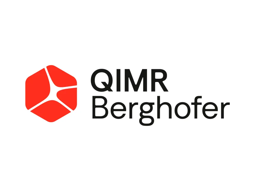
The new logo features a bold hexagonal shape in red, with a dynamic white structure inside that resembles both a cellular structure and a cross-section of an organ or microscopic life form. This is highly symbolic, aligning with the institute’s work in biomedical science and microscopic-level research.
The hexagon is often associated with strength, structure, and molecular forms in science and design, which gives the logo a strong conceptual foundation rooted in research and stability.
The dominant color used is vibrant red, a color that conveys energy, urgency, and health — all of which resonate with the mission of a medical research institute. Red also evokes blood and life, subtly connecting to biological and clinical research.
The typography is black, adding a professional, clean, and academic tone to the brand identity. The balance between red and black gives the logo both emotional energy and intellectual seriousness.
The font used in the logo is a modern sans-serif typeface. The contrast between “QIMR” in all caps and “Berghofer” in title case adds hierarchy and clarity, while also respecting the donor’s legacy.
The rounded terminals in the letters and the clean geometric forms ensure the logo feels approachable yet authoritative — a vital balance for institutions in the public health and research sector.
This is a combination mark: it merges a graphic symbol with text. This format is ideal for branding flexibility, allowing for the use of the symbol independently in digital applications while retaining full identity strength in formal or institutional settings.
The QIMR Berghofer logo successfully encapsulates the cutting-edge and compassionate nature of the institute’s work. It merges visual clarity with deep symbolic meaning, making it both memorable and meaningful.
It presents QIMR Berghofer not just as a medical research facility, but as a forward-thinking, globally-minded, and community-focused organization.
The QIMR Berghofer logo can be downloaded in vector formats such as SVG, AI, PDF, and transparent PNG for free from logowik.com. These formats are ideal for designers, developers, and media professionals needing high-quality, scalable versions for different applications.


