- Brands Logos
- Logo Templates
- Icons
- Vectors
- Font In Logos
- Blog
Seattle Reign FC is a professional women’s soccer club based in Seattle, Washington, competing in the National Women’s Soccer League (NWSL). The club was established in 2012 and has been a significant force in the league since its inception. Founded by Bill and Teresa Predmore, the club has built a strong reputation for excellence both on and off the field. Over the years, Seattle Reign FC has seen changes in ownership, branding, and stadiums, but its commitment to women’s soccer and its passionate fanbase have remained constant.
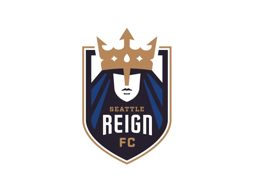
Seattle Reign FC’s visual identity has evolved alongside the club. The original logo, introduced at the club’s founding, featured a more literal interpretation of the "Reign" concept with a queen figure, a crown, and bold, royal colors. Over time, the club aimed to modernize its visual identity to better align with its ambitions and to create a more iconic, versatile mark. The new logo represents a significant evolution, embracing modern design principles while maintaining the regal theme that is central to the club’s identity.
The new Seattle Reign FC logo is a masterful blend of tradition and modernity. The shield shape forms the foundational structure, symbolizing strength and unity, a common choice for sports clubs seeking a timeless appearance. At the center, the stylized queen’s face with a crown immediately communicates the “Reign” concept, representing leadership, power, and a connection to the city’s royal theme. The use of sharp geometric lines in the crown and the figure’s cloak create a sense of forward movement and energy, fitting for a competitive sports team.
Color selection is deliberate and impactful. The deep navy blue conveys trust, stability, and professionalism, while the gold accents add a touch of prestige and excellence. The white used in the face and typography provides balance and clarity, ensuring the logo remains legible across various applications. The inclusion of "SEATTLE" and "FC" in gold, with "REIGN" in bold white, emphasizes the club’s identity and pride in its home city.
Typography is clean and assertive, with sans-serif fonts that suggest modernity and confidence. The vertical arrangement and differing font weights create a clear hierarchy, guiding the viewer’s eye and enhancing brand recall.
The logo is an example of an emblem logo, combining iconography and typography within a single, cohesive mark. The crown is the dominant element, symbolizing royalty and leadership. The queen’s stylized face is intentionally abstract, allowing for broader representation and inclusivity, which resonates with the club’s values. The use of shield reinforces the competitive and protective nature of the club.
The blue and gold color palette ties back to traditional regal colors, underscoring the theme of royalty. Geometric shapes in the cloak suggest dynamism and movement, aligning with the energy and pace of soccer.
Seattle Reign FC’s latest logo can be downloaded for free in various vector and transparent formats, such as SVG, PDF, AI, and transparent PNG, on logowik.com. These formats ensure that the logo can be used for both digital and print purposes while maintaining its visual quality.
Seattle Reign FC’s new logo successfully balances legacy and innovation, providing the club with a bold, modern identity while honoring its regal roots. Through strong symbolism, an impactful color scheme, and thoughtful design, the logo sets the club apart in the landscape of women’s professional soccer and reinforces its position as a leader both on and off the pitch.