
- Brands Logos
- Logo Templates
- Icons
- Vectors
- Font In Logos
- Blog
Sessions is a modern hospitality brand founded in the UK, aiming to revolutionize the way food concepts are created, distributed, and scaled. The company operates with a mission to empower independent food entrepreneurs by giving them platforms, tools, and exposure to grow without the burden of traditional restaurant ownership. It was founded by Dan Warne, the former Managing Director of Deliveroo UK, and officially launched in 2020.
With a strong digital foundation, Sessions has created a hybrid model combining virtual brands, physical locations, and tech-driven insights. It has rapidly gained attention across the UK and Europe as a next-gen food brand incubator.
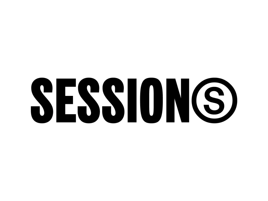
The Sessions logo features a clean, modern wordmark with a bold, impactful design. The typeface is a strong, sans-serif font in all uppercase letters, which reflects authority, confidence, and a contemporary feel. At the end of the logo, the final “S” is enclosed within a double circle, reminiscent of a copyright or trademark symbol, giving it a distinctive identity.
The typography is bold, geometric, and sans-serif, designed to convey strength and clarity. This font choice aligns with the brand's vision of innovation and confidence in the food tech and hospitality sectors.
The logo is rendered entirely in black and white. Black symbolizes elegance, strength, and professionalism. White space gives it clarity and balance. The monochrome palette ensures maximum contrast and versatility, allowing the logo to stand out in both digital and physical environments.
The logo is a wordmark with a symbolic twist. It starts as a straightforward logotype spelling out "SESSIONS", but the inclusion of the final “S” within a circular enclosure acts as a subtle emblem. This design decision makes the logo more memorable while hinting at protection, branding, and originality.
The final “S” inside a circle could represent several symbolic meanings:
A stamp of quality or approval
A stylized reference to the digital and trademarked world
A spotlight or focus on the last element—possibly hinting at completion or perfection
This iconic “S” could also stand alone as a symbol in app icons, social media profiles, and merchandise, enhancing the brand's flexibility in visual identity.
Since Sessions is a relatively young brand (launched in 2020), the logo has remained consistent since its inception. This is typical for startups aiming to build strong brand recognition early on. The minimalistic yet bold approach helps establish trust and modernity without frequent redesigns.
The Sessions logo is a textbook example of how simplicity and smart symbolism can combine to create a strong, scalable brand identity. It is clean, versatile, and bold—qualities that align with Sessions’ innovative approach in hospitality.
You can download the Sessions logo in vector formats such as SVG, PDF, AI, and transparent PNG for free from logowik.com.


