
- Brands Logos
- Logo Templates
- Icons
- Vectors
- Font In Logos
- Blog
SmythOS is an advanced orchestration platform designed to simplify the creation, deployment, and management of autonomous AI agents. It targets developers, data scientists, and businesses looking to integrate large language models (LLMs), APIs, and third-party tools into efficient workflows. The platform is positioned at the cutting edge of AI operations, enabling rapid agent development, secure deployment, and comprehensive observability. While relatively new, SmythOS is making a name for itself in the emerging AI infrastructure space.
Although detailed historical information such as the exact founding date or the founder's name is not publicly available, SmythOS represents a modern solution tailored for enterprise-level AI use cases, and is particularly known for supporting multi-agent systems and robust integration capabilities.
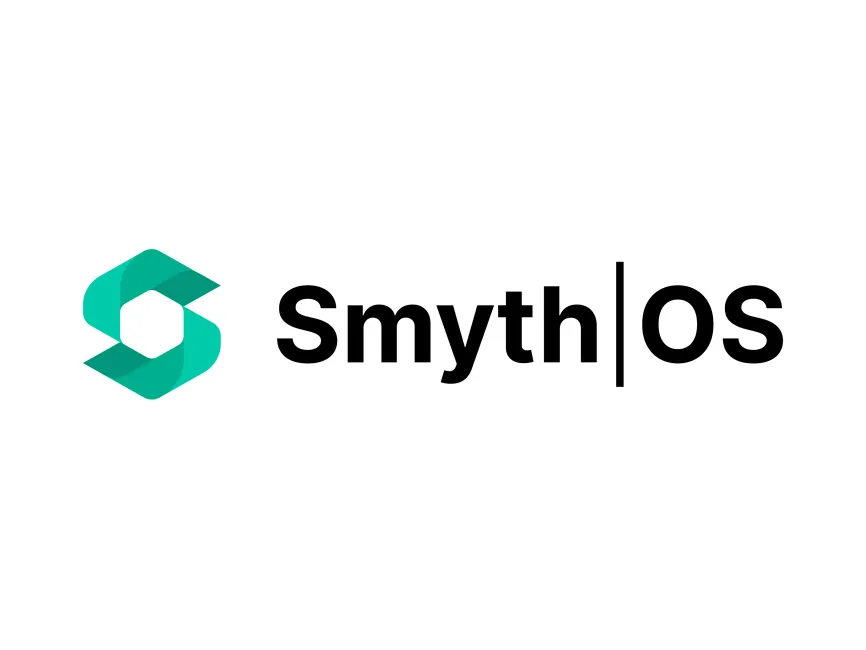
The SmythOS logo is a fine example of minimalistic yet meaningful design in the modern tech landscape. It successfully combines a geometric symbol with clean typography, resulting in a sophisticated and memorable visual identity.
The emblem to the left of the brand name features an abstract geometric figure composed of two interlocking shapes that form a stylized “S” around a negative space hexagon. This can be interpreted as a subtle nod to modularity and connectivity—concepts crucial to what SmythOS offers. The negative space hexagon may represent a "core" or "hub", aligning with the brand’s core functionality as an integration and automation platform.
This approach highlights collaboration, integration, and complexity managed through simplicity, resonating well with the platform’s promise.
The logo uses a vibrant teal green color (#00BFA6 or a similar tone), which communicates innovation, growth, and trust—qualities highly valued in the tech industry. This color choice balances modern aesthetics with a sense of technical reliability.
The brand name itself, "Smyth|OS", is rendered in solid black, suggesting authority, clarity, and professionalism. The use of black for the text ensures strong readability and contrast when combined with the teal icon.
The typography is clean, sans-serif, and modern, likely based on a geometric or humanist font family. The division between “Smyth” and “OS” with a vertical line (|) is a clever design detail. It visually separates the company name from the abbreviation "OS" (which likely stands for "Operating System"), reinforcing the brand's identity as an AI infrastructure layer.
This combination gives the logo a professional yet approachable character, ideal for enterprise-level software products.
This is a combination mark—a hybrid of a logomark (the icon on the left) and a logotype (the text on the right). This style provides versatility, as the icon can be used independently in mobile applications or favicons, while the full version enhances brand recognition in formal contexts.
As SmythOS is a relatively new brand, there’s no publicly documented logo redesign history. However, the current logo’s polish and balance indicate a professionally developed identity, likely crafted with long-term brand consistency in mind.
SmythOS’s logo is a strong visual embodiment of a forward-thinking AI software brand. With its clean geometry, strategic color use, and thoughtful typography, it positions the company as a trustworthy and innovative player in the AI automation ecosystem. The logo not only aligns well with tech industry trends but also communicates the core values of modularity, reliability, and smart integration.
The SmythOS logo can be downloaded in scalable vector formats such as SVG, PDF, AI, and transparent PNG for free from Logowik.com.


