
- Brands Logos
- Logo Templates
- Icons
- Vectors
- Font In Logos
- Blog
Dawtona new 2025 vector logo (SVG, Ai, EPS, PNG and PDF format) Free Download
Dawtona is a Polish food company specializing in canned and processed food products, including tomatoes, vegetables, fruit preserves, and sauces. Founded in 1991 in Błonie, Poland, Dawtona is a family-owned business that has grown into one of the country's leading brands in the food industry. The company is known for its commitment to quality, natural ingredients, and sustainable agricultural practices.
Dawtona has established itself as a trusted brand, offering a wide range of products that cater to both household consumers and the food service industry. With a strong emphasis on Polish agricultural produce, the company ensures that its products are made from locally sourced ingredients.
Over the years, Dawtona has maintained a brand identity that reflects its values of tradition, freshness, and family heritage. While the core elements of the logo have remained consistent, recent updates have modernized its look, making it more appealing to contemporary consumers.
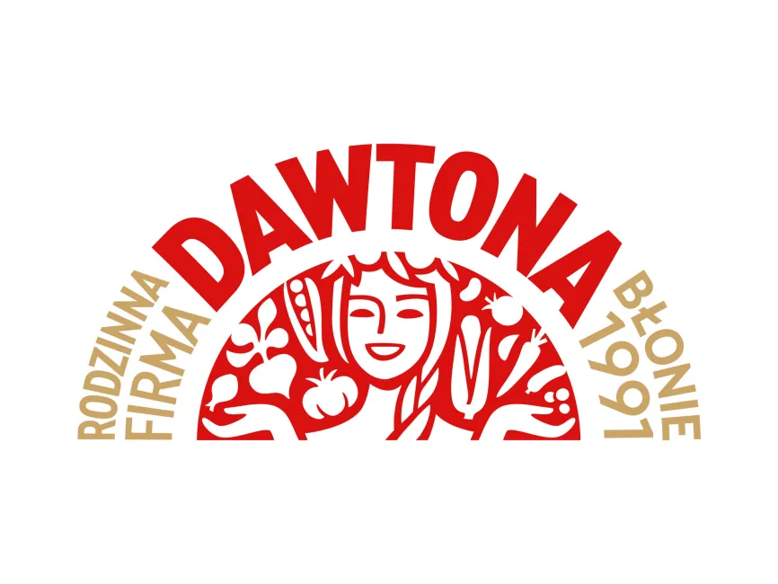
The Dawtona new logo features a distinctive, semi-circular design that combines typography with an illustration. The centerpiece of the logo is a stylized depiction of a smiling woman, likely representing a farmer or a symbolic figure of Polish agricultural tradition. She is surrounded by various vegetables and fruits, emphasizing the brand’s focus on fresh, natural ingredients.
The curved shape of the logo, along with the arching text, creates a sense of unity and tradition. The depiction of hands holding vegetables reinforces themes of care, quality, and farm-to-table freshness.
The typography in the Dawtona logo is bold and slightly curved, following the shape of the semi-circle. The capitalized letters enhance visibility and impact, making the brand name easy to recognize. The surrounding text, which includes “Rodzinna Firma” (Family Company) and “Błonie 1991” (referring to its founding location and year), adds a storytelling element that highlights the brand’s heritage.
Dawtona’s logo is a combination mark, integrating both a symbolic illustration and text. This type of logo is effective for brands with a strong story to tell, as it allows for both visual and textual communication. The detailed illustration gives the logo a unique and artistic touch, setting it apart from more minimalist food brand logos.
The Dawtona logo successfully communicates the brand’s identity through its rich symbolism, vibrant color scheme, and strong typography. The combination of traditional elements with a modern design approach makes it both recognizable and meaningful. The emphasis on fresh produce and family values aligns well with Dawtona’s mission of providing high-quality, locally sourced food products.
For those looking to download the Dawtona logo in vector formats such as SVG, PDF, AI, and transparent PNG, it is available for free on Logowik.com.


