Punjab Kings Logo Vector Download

Punjab Kings Logo Free Vector Download SVG AI PDF PNG

Punjab Kings (PBKS) is a franchise cricket team in the Indian Premier League (IPL), representing the state of Punjab, India. The team was originally founded as Kings XI Punjab (KXIP) in 2008 and was rebranded to Punjab Kings in 2021 to give the team a fresh and more inclusive identity.

Brief History of Punjab Kings

  • Founded: 2008 (as Kings XI Punjab)
  • Rebranded: 2021 (as Punjab Kings)
  • Home Ground: PCA Stadium, Mohali, Punjab
  • Owner: Preity Zinta, Ness Wadia, Mohit Burman, Karan Paul
  • Captain (2024): Shikhar Dhawan
  • Coach (2024): Trevor Bayliss
  • Official Website: www.punjabkingsipl.in

The name change was meant to remove regional limitations and present the team as a more powerful and global brand.

Punjab Kings Logo Design Analysis

Shape and Structure

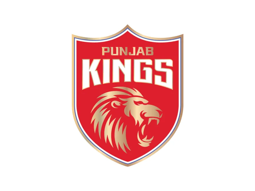
The Punjab Kings logo features a shield design, which is widely used in sports branding to represent power, pride, and tradition.

  • Shield Design: Represents strength, protection, and legacy.
  • Pointed Upper Edge: Gives a sharp and royal look, emphasizing authority.
  • Bold Typography: Ensures clarity and dominance in branding.

Color Palette

The PBKS logo is designed with a red, gold, and white color scheme, which reflects royalty, passion, and determination.

  • Red: Symbolizes power, energy, and aggression—qualities essential for competitive cricket.
  • Gold: Represents royalty, prestige, and success, aligning with the "Kings" theme.
  • White: Enhances contrast and provides a clean, premium look.

Typography

The text "Punjab Kings" is displayed in bold, uppercase, geometric typography, enhancing visibility and impact.

  • Capital Letters: Convey strength and confidence.
  • Angular Font Design: Adds sharpness and a modern appeal.
  • Gold Outlining: Enhances readability and reflects a regal theme.

Symbolism of the Roaring Lion

A golden roaring lion is the central element of the Punjab Kings logo, representing:

  • Fearlessness: The lion is a symbol of bravery and dominance.
  • Royalty: Aligns with the "Kings" branding, as lions are often associated with leadership.
  • Aggression & Passion: Essential qualities for a team competing at the highest level.

The lion’s mane and fierce expression add an extra layer of intensity, making the logo visually striking.

Evolution of the Punjab Kings Logo

Previously known as Kings XI Punjab, the team had a different logo with two roaring lions and a shield. However, after rebranding in 2021, the logo was redesigned with a more refined and powerful identity.

Key changes after the rebranding:

  • Simplified shield design (removing extra elements for a cleaner look).
  • Stronger focus on the lion symbol (making it the centerpiece).
  • Bolder typography and color scheme (for a more dominant presence).

This rebranding was aimed at making the team’s image more modern, aggressive, and premium.

Brand Identity and Recognition

The Punjab Kings logo is prominently featured across:

  • Team Jerseys & Merchandise (caps, t-shirts, accessories).
  • Cricket Stadium Branding (banners, flags, LED screens).
  • Digital Platforms (social media, website, promotional content).
  • Media & Advertising (TV broadcasts, sponsorships, and campaigns).

The bold shield design, roaring lion, and striking color palette make it one of the most impactful IPL logos.

The Punjab Kings logo is a perfect representation of strength, royalty, and aggression, aligning with the team’s identity. The shield shape, roaring lion, and rich color scheme make it a standout logo in the IPL. The redesign in 2021 further enhanced its modern and regal appeal, making it a powerful brand symbol.

Download Punjab Kings Logo

The Punjab Kings logo is available for free download in SVG, PDF, AI, and transparent PNG formats on logowik.com.

Releated Blogs
Logo Details
  • 431
  • 3160

@logowik

  • 64239 Logos